Can't find the right component?
Describe it and Shuffle AI builds it in seconds, ready to edit and export.
Browse 114 ready-made Tailwind CSS components from the Metis UI library. Every variant is fully responsive – copy the code or customize it in the visual editor and export clean code.
Create a free account to copy production-ready code from every component in the library.

Free account · No credit card · No password needed
Already have an account? Sign in
Components are just the start. See how a project goes from prompt to production‑ready code with Shuffle.
A landing page hero with a navigation bar, centered headline and subheading, two CTA buttons, and a faded dashboard illustration surrounded by pastel blobs. A row of muted company logos sits below the illustration as social proof.
Create a free account to copy production-ready code from every component in the library.
Free account · No credit card · No password needed
Already have an account? Sign in
Components are just the start. See how a project goes from prompt to production‑ready code with Shuffle.
A landing page hero for the Metis product featuring a centered headline, subtext, and two CTA buttons above an illustrative dashboard screenshot with overview metrics and transaction tables. A row of partner logos appears beneath the preview.
Create a free account to copy production-ready code from every component in the library.
Free account · No credit card · No password needed
Already have an account? Sign in
Components are just the start. See how a project goes from prompt to production‑ready code with Shuffle.
Create a free account to copy production-ready code from every component in the library.
Free account · No credit card · No password needed
Already have an account? Sign in
Components are just the start. See how a project goes from prompt to production‑ready code with Shuffle.
Create a free account to copy production-ready code from every component in the library.
Free account · No credit card · No password needed
Already have an account? Sign in
Components are just the start. See how a project goes from prompt to production‑ready code with Shuffle.
Create a free account to copy production-ready code from every component in the library.
Free account · No credit card · No password needed
Already have an account? Sign in
Components are just the start. See how a project goes from prompt to production‑ready code with Shuffle.
Create a free account to copy production-ready code from every component in the library.
Free account · No credit card · No password needed
Already have an account? Sign in
Components are just the start. See how a project goes from prompt to production‑ready code with Shuffle.
Create a free account to copy production-ready code from every component in the library.
Free account · No credit card · No password needed
Already have an account? Sign in
Components are just the start. See how a project goes from prompt to production‑ready code with Shuffle.
Create a free account to copy production-ready code from every component in the library.
Free account · No credit card · No password needed
Already have an account? Sign in
Components are just the start. See how a project goes from prompt to production‑ready code with Shuffle.
Create a free account to copy production-ready code from every component in the library.
Free account · No credit card · No password needed
Already have an account? Sign in
Components are just the start. See how a project goes from prompt to production‑ready code with Shuffle.
Create a free account to copy production-ready code from every component in the library.
Free account · No credit card · No password needed
Already have an account? Sign in
Components are just the start. See how a project goes from prompt to production‑ready code with Shuffle.
A blog section titled "Our Blog" showing five post cards in a mixed grid, with one wide card and several square cards, each with abstract fluid-art images, category label, date, heading, and excerpt. A blue "Show all posts" button is centered below the grid.
Create a free account to copy production-ready code from every component in the library.
Free account · No credit card · No password needed
Already have an account? Sign in
Components are just the start. See how a project goes from prompt to production‑ready code with Shuffle.
A centered, light-background hero section with a small blue pill badge, a large bold two-line heading, gray supporting text, and a primary filled button paired with a secondary outlined button. The stacked layout and minimal styling make it suited to marketing landing pages.
Create a free account to copy production-ready code from every component in the library.
Free account · No credit card · No password needed
Already have an account? Sign in
Components are just the start. See how a project goes from prompt to production‑ready code with Shuffle.
A light-background section with a small pill badge, a bold two-line heading, and muted supporting text above a mixed-size grid of architectural photographs. The grid combines small square tiles with larger spanning tiles, presenting building images as illustrative content rather than interactive controls.
Create a free account to copy production-ready code from every component in the library.
Free account · No credit card · No password needed
Already have an account? Sign in
Components are just the start. See how a project goes from prompt to production‑ready code with Shuffle.
A centered hero section with a two-line bold heading, a muted subheading, and an inline email input paired with a blue Sign Up button. It is a simple light-background landing section for collecting email addresses.
Create a free account to copy production-ready code from every component in the library.
Free account · No credit card · No password needed
Already have an account? Sign in
Components are just the start. See how a project goes from prompt to production‑ready code with Shuffle.
A split-layout team section with a pill label, large heading, and supporting paragraph on the left, and a two-column grid of circular avatar photos with names and job titles on the right. The design is light and minimal with generous whitespace and no interactive controls visible.
Create a free account to copy production-ready code from every component in the library.
Free account · No credit card · No password needed
Already have an account? Sign in
Components are just the start. See how a project goes from prompt to production‑ready code with Shuffle.
A pricing section with a centered heading and three side-by-side plan cards (Beginner, Intermediate, Professional) showing monthly prices, feature checklists, and Start Free Trial and Purchase buttons. The middle Intermediate card is highlighted with a solid blue background to emphasize it.
Create a free account to copy production-ready code from every component in the library.
Free account · No credit card · No password needed
Already have an account? Sign in
Components are just the start. See how a project goes from prompt to production‑ready code with Shuffle.
A dark rounded banner titled Cookie Policy with a paragraph explaining cookie usage and two action buttons, Accept Cookies (filled blue) and Refuse Cookies (outlined). It functions as a notification-style consent prompt displayed as a contained card.
Create a free account to copy production-ready code from every component in the library.
Free account · No credit card · No password needed
Already have an account? Sign in
Components are just the start. See how a project goes from prompt to production‑ready code with Shuffle.
A comparison table listing eight example packages against five features, with green check and red cross-circle icons indicating inclusion or exclusion. Rows alternate between light gray and white backgrounds on a white card with a light page background.
Create a free account to copy production-ready code from every component in the library.
Free account · No credit card · No password needed
Already have an account? Sign in
Components are just the start. See how a project goes from prompt to production‑ready code with Shuffle.
A split-screen sign-in page with a left-side form containing email and password fields, a primary Sign In button, and Facebook and Google social login options. The right panel displays a large blue illustration of a person walking a dog beside city buildings, serving as decorative brand imagery.
Create a free account to copy production-ready code from every component in the library.
Free account · No credit card · No password needed
Already have an account? Sign in
Components are just the start. See how a project goes from prompt to production‑ready code with Shuffle.
A two-column contact section with a heading and phone, email, and address details on the left, and a form with department radio options, subject, name, email, message fields, a terms checkbox, and a blue Submit button on the right.
Browse 114 of ready-made components in Tailwind and Metis library. They are divided into UI libraries that our professional designers designed. Each of them has a resource of many variations of different types of components. Under each of them, there is a clear code created by our team of developers.
All elements available in the editor are fully responsive. You will get full access to them by subscribing to our drag and drop editor.
How you’ll build with Shuffle.
© 2026 Shuffle. All rights reserved.
See what you're getting before you commit.
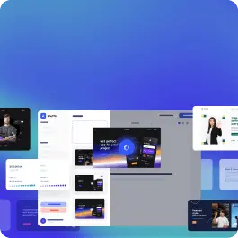
Switch the editor to Grid and every page of your project appears side by side on one canvas. Arrange them freely, zoom in and out, and add as many new pages as you need in a few clicks.
Describe what you need in one chat and the Agent does the rest: it adds new sections, edits copy and styles, moves blocks around or removes them across your whole page. No modes, no switching, just tell it what to change.
Not quite there yet? Ask for tweaks like missing assets, your logo or other details, and regenerate the design without starting from scratch.