Redirecting to PayPal

Tailwind CSS Components – Asitrastudio Library

Browse 122 ready-made Tailwind CSS components from the Asitrastudio UI library. Every variant is fully responsive – copy the code or customize it in the visual editor and export clean code.

Tailwind Component #41

Tailwind Component

Newsletter Signup Hero with Avatar Cluster

A centered newsletter subscription section with a large heading, supporting paragraph, and an email input paired with a black Sign Up button. Circular user avatars are arranged around the headline on both sides, creating a light-background call to action.

Tailwind Component #42

Tailwind Component

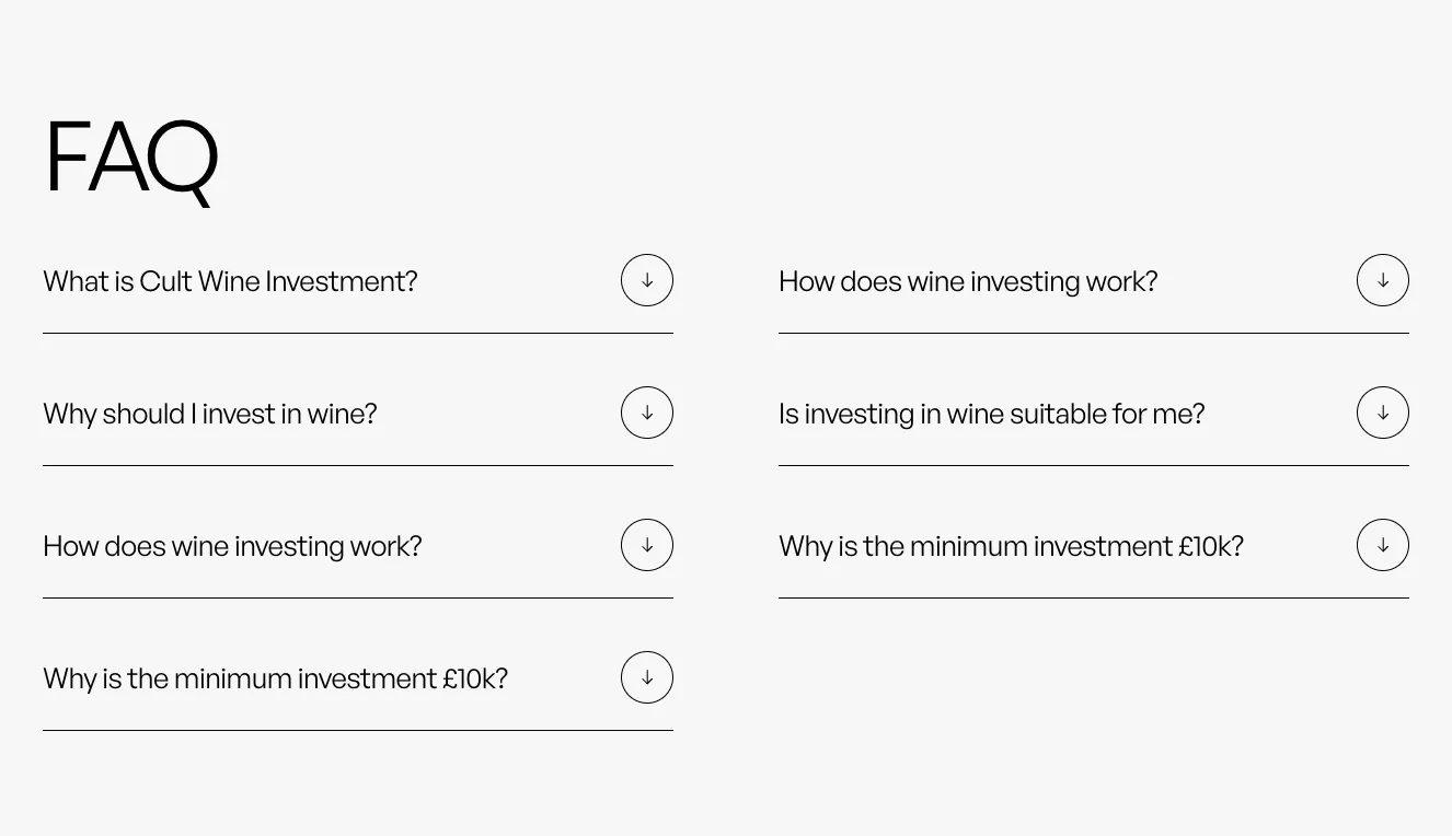
FAQ Accordion with Two-Column Questions

A light-background FAQ section with a large heading and eight collapsible questions arranged in two columns, each with a circular downward arrow toggle and a horizontal divider line. It is used to present frequently asked questions about wine investing.

Tailwind Component #43

Tailwind Component

Dark Centered Hero with Large Heading and Blue CTA Button

A full-width dark hero section with a small eyebrow label, a large two-line sans-serif heading, a muted supporting paragraph, and a single blue pill-shaped call-to-action button with an arrow icon. The content is centered in a vertical stack with generous whitespace.

Tailwind Component #44

Tailwind Component

Yellow Warning Notification Banner: Email Confirmation Required

A single-line yellow alert banner with a rounded outlined container, a warning icon, and a message asking the user to confirm their email address before viewing content. It has no dismiss control or action button visible.

Tailwind Component #45

Tailwind Component

Minimal Top Navigation Bar with Centered Logo and CTA Button

A horizontal header navigation bar with text links (About, Services, Projects, Contact us) on either side of a centered wordmark logo, ending with an outlined pill-shaped call-to-action button labeled 'Get consulation' with an arrow icon. The layout is clean and minimal on a light background.

Tailwind Component #46

Tailwind Component

Blog Carousel with Article Cards and Navigation Arrows

A horizontally scrolling blog section with a large heading, circular previous/next arrow buttons, and rounded article cards showing image, category tag, read time, title, and excerpt. A centered 'See our blog' text link sits below the carousel, and the third card is cropped at the right edge.

Tailwind Component #47

Tailwind Component

Open Positions Job Listing with Arrow Links

A minimal light-background section headed by large 'Open Positions' text, with a pill outline button at top right and a vertical list of four job rows, each showing employment type and remote status above a job title with a diagonal arrow link and a divider line.

Tailwind Component #48

Tailwind Component

Premium Membership Pricing Comparison with Monthly/Yearly Toggle

A pricing section titled Premium Membership showing three plan columns (Free, $29/month, $59/month) with feature checklists, Get started buttons, and a Billed monthly/yearly toggle with a 20% SAVE badge. The highlighted middle plan uses a solid blue CTA and a blue gradient background to differentiate it.

Tailwind Component #49

Tailwind Component

Tailwind Component #50

Tailwind Component

Testimonials Carousel with Photo and Quote Card

A testimonials section with a large heading, circular previous and next arrow controls, and a featured quote card pairing a photo of a person in a yellow hoodie with a paragraph of text and the author name and title. A partial second card peeks in from the right edge, indicating a horizontal carousel.

Tailwind Component #51

Tailwind Component

Breadcrumb Navigation Bar with Homepage, Services, and Lorem Ipsum

A horizontal breadcrumb trail showing a page hierarchy separated by slash dividers, with Homepage, Services, and Lorem Ipsum as text links on a light gray background. It provides location context and navigation within a site.

Tailwind Component #52

Tailwind Component

Tailwind Component #53

Tailwind Component

Tailwind Component #54

Tailwind Component

Tailwind Component #55

Tailwind Component

Tailwind Component #56

Tailwind Component

Tailwind Component #57

Tailwind Component

Tailwind Component #58

Tailwind Component

Tailwind Component #59

Tailwind Component

Tailwind Component #60

Tailwind Component

The easiest way to create beautiful websites

Black Weeks · Our best offer ▼

The selected plan includes lifetime access to Shuffle Editor.

Lifetime License

Create an account

OR USE EMAIL

Black Weeks pricing: our best offer of the year.

Why creators choose Shuffle

From idea to beautiful design in minutes.

Shuffle pairs an AI visual editor with 80+ UI libraries, so you can design, build and export production‑ready code without starting from scratch.

  • An AI Agent that builds with you Describe a page, watch it come to life, then fine-tune it visually or with a prompt.
  • Pick the best model for every task GPT-6 Astra, Claude Opus 5.5 and Gemini 4 Argon in one place.
  • 13,400+ professionally designed components Prefer building by hand? Drag in pixel-perfect sections crafted by professional designers.
  • Export to the stack you love Next.js, Astro, Laravel, WordPress, Shopify, static HTML and beyond.
“Its AI-powered features have transformed how I work! Designing and building websites has become faster, easier, and far more efficient.”
Est. 2019
Helping web builders ship since 2019 7 years of steady development.

Sign in to open the editor

Create a free account to customize this component visually and with AI.

Free account · No credit card · No password needed

Make it yours with AI

Start with this component. Tell AI what to change.

Original
Preview the original component.
Your Version
Available when your generation is complete.
Code
Available when your generation is complete.
Original component

Add images & videos

Upload an asset, then tell AI how to use it.

How it works

Your uploaded file will be added directly to the generated component. After uploading, you can guide the AI on where exactly to use it, e.g. as a logo or as a section image.

© 2026 Shuffle. All rights reserved.