Browse 124 ready-made components from the Dashy UI library. Every variant is fully responsive – copy the code or customize it in the visual editor and export clean code.
 Dashy
Dashy
Full Shuffle Editor access for just $10
Great for quick projects and for testing everything Shuffle can do. One-time payment, not a subscription.
Get 7-Day PassNew to Shuffle? Try our tools:

Create a free account to copy production-ready code from every component in the library.
Free account · No credit card · No password needed
Already have an account? Sign in
A white card containing an Activity title, a 'This week' dropdown selector in the top right, and a smooth blue line area chart plotting daily values from Sunday to Saturday on a 0.0 to 10.0 y-axis. The layout is a single contained card focused on displaying analytics data.

Create a free account to copy production-ready code from every component in the library.
Free account · No credit card · No password needed
Already have an account? Sign in
A simple page header showing a bold greeting 'Welcome John' with a waving hand emoji, followed by a muted subtitle prompting the user to check today's sales report. It has no other controls, cards, or navigation visible, so it reads as a minimal dashboard greeting banner.


Create a free account to copy production-ready code from every component in the library.
Free account · No credit card · No password needed
Already have an account? Sign in
A horizontal row of four white stat cards on a light gray background, each showing a centered label, a large bold numeric value, and a small 'Last updated 2 hours ago' timestamp. Used to display key business metrics at a glance.

Create a free account to copy production-ready code from every component in the library.
Free account · No credit card · No password needed
Already have an account? Sign in
A white toast notification in the top-right corner over a muted gray background, showing a success message 'Transfer successful' with a gradient transfer icon, supporting text, and a dismiss close button. It conveys a single status update about a completed file transfer.

Create a free account to copy production-ready code from every component in the library.
Free account · No credit card · No password needed
Already have an account? Sign in
A horizontal breadcrumb trail showing a home icon followed by 'Reports' and 'Weekly Report' separated by slash dividers. It indicates the current page location within a hierarchy on a light background.

Create a free account to copy production-ready code from every component in the library.
Free account · No credit card · No password needed
Already have an account? Sign in
A media library page with a back-to-home link, a Media Files heading, and a two-row grid of ten image cards, each showing a file name and size beneath the thumbnail. The layout is a repeated card grid of interior photographs with no visible navigation bar, filters, or action controls beyond the back link.

Create a free account to copy production-ready code from every component in the library.
Free account · No credit card · No password needed
Already have an account? Sign in
A white rounded card titled Top Customers listing five customers with circular avatars, names, email addresses, and right-aligned spending amounts in a vertical list. It presents ranked customer spending data on a light neutral background with no visible controls.

Create a free account to copy production-ready code from every component in the library.
Free account · No credit card · No password needed
Already have an account? Sign in
A horizontal top navigation bar for an application dashboard, showing a circular logo, text tabs (Dashboard, Tweets, Growth, Spaces, Followers), a gradient "14 days left" status badge, a user avatar, and a dropdown chevron. The bar uses a light background with minimal styling.

Create a free account to copy production-ready code from every component in the library.
Free account · No credit card · No password needed
Already have an account? Sign in
A dark rounded banner asking users for feedback on team insights, with a heading, supporting sentence, and a gradient "Share your feedback" button. Decorative gradient arcs sit in the top-right and bottom-right corners.

Create a free account to copy production-ready code from every component in the library.
Free account · No credit card · No password needed
Already have an account? Sign in
A single-line notification banner on a light background with an info icon, a gradient-colored promotional message about September office hours and WME updates, and a close button on the right. It conveys a status or announcement message in a contained card.

Create a free account to copy production-ready code from every component in the library.
Free account · No credit card · No password needed
Already have an account? Sign in
A centered empty-state message on a light background prompting the user to customize their timeline and add a first product. It stacks a bold heading, supporting text, and a gradient call-to-action button vertically.

Create a free account to copy production-ready code from every component in the library.
Free account · No credit card · No password needed
Already have an account? Sign in
A light modal dialog over a gray overlay asking what Dashy will be used for, with a close button, a 3x2 grid of selectable cards each showing an icon, label, and short description, and a gradient call-to-action button at the bottom.

Create a free account to copy production-ready code from every component in the library.
Free account · No credit card · No password needed
Already have an account? Sign in
A white rounded card showing the Dashy logo, a four-segment progress indicator with the first segment highlighted in a red-to-blue gradient, and the step label "1. Create A Project" centered below. It functions as a header-style progress indicator for a multi-step onboarding flow.
Create a free account to copy production-ready code from every component in the library.
Free account · No credit card · No password needed
Already have an account? Sign in
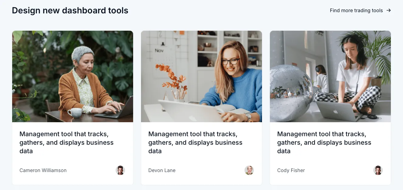
A section headed 'Design new dashboard tools' with a 'Find more trading tools' link, followed by three equal cards each showing a stock-style photo, a 'Management tool that tracks, gathers, and displays business data' description, and an author name with avatar. The layout is a horizontal row of cards with rounded corners on a light background.

Create a free account to copy production-ready code from every component in the library.
Free account · No credit card · No password needed
Already have an account? Sign in
A single form row on a light card with a bold 'Username' label and helper text 'Enter your website url', paired with a text input that has a fixed 'dashy.com/' prefix segment. Used to collect a custom username or subdomain for a website URL.

Create a free account to copy production-ready code from every component in the library.
Free account · No credit card · No password needed
Already have an account? Sign in

Create a free account to copy production-ready code from every component in the library.
Free account · No credit card · No password needed
Already have an account? Sign in
A white bordered card titled Analytics containing a donut chart with an 80% Investment center label and a legend for Sale, Expenses, and Revenue. The chart uses blue, dark navy, and light gray segments with a neutral layout and minimal styling.

Create a free account to copy production-ready code from every component in the library.
Free account · No credit card · No password needed
Already have an account? Sign in
A horizontal tab bar with icon and label items for My Account, Licenses, Products, and Transactions on a light gray background. The active tab uses darker text and a person icon, while inactive tabs appear in muted gray, indicating a settings or account management section switcher.

Create a free account to copy production-ready code from every component in the library.
Free account · No credit card · No password needed
Already have an account? Sign in
A compact, light-themed dropdown list titled 'Select a Company' showing three company options, each with a colored logo circle, company name, and member count range. The panel has a chevron toggle in the header and a bordered, rounded container.
Create a free account to copy production-ready code from every component in the library.
Free account · No credit card · No password needed
Already have an account? Sign in
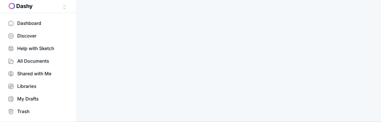
A vertical sidebar navigation panel with a Dashy workspace selector at the top and a list of icon-labeled links including Dashboard, Discover, Help with Sketch, All Documents, Shared with Me, Libraries, My Drafts, and Trash. The panel sits beside a large empty light gray main content area.


Choose from 124 of ready-made UI components available in Shuffle Editor.
By subscribing to the editor, you get access to all of them.
The UI libraries are available in four frameworks - Tailwind CSS, Bootstrap, Bulma, and Material-UI (React). We divided them into components, under which there is clear code. In Shuffle Editor, you can build whole templates from them, editing styles, texts, images, and other features. You can also export them as code and work in your favorite IDE.

Build websites faster with an AI Visual Editor



© 2026 Shuffle. All rights reserved.
See what you're getting before you commit.
Switch the editor to Grid and every page of your project appears side by side on one canvas. Arrange them freely, zoom in and out, and add as many new pages as you need in a few clicks.
Describe what you need in one chat and the Agent does the rest: it adds new sections, edits copy and styles, moves blocks around or removes them across your whole page. No modes, no switching, just tell it what to change.
Not quite there yet? Ask for tweaks like missing assets, your logo or other details, and regenerate the design without starting from scratch.


























