Browse 1,117 ready-made components from the Solstice UI library. Every variant is fully responsive – copy the code or customize it in the visual editor and export clean code.
Cookie Consent Banner with Decline and Allow Buttons
A horizontal, rounded cookie consent notice with a cookie icon, a short message about storing cookies to personalize the experience, and two action buttons: an outlined Decline button and a filled orange Allow button. It sits as a single bar on a light background.
A horizontal strip on a white background with a short text heading on the left and four placeholder company logos on the right, used to build trust by showing partner or backer brands. The layout is a single row with generous spacing between logos.
Solstice Light Footer with Link Columns and Social Links
A light-background website footer displaying the Solstice logo, three link columns (Platform, Platform, Platform), a HIRING badge beside Careers, and circular social media follow links for Twitter, Instagram, and LinkedIn with a copyright line at the bottom. The layout arranges link columns horizontally on the left and social links stacked vertically on the right.
Newsletter Subscribe Section with Email Form and App Preview
A split-layout newsletter signup section with a badge, heading, supporting text, email input, and orange subscribe button on the left, and an illustrative app preview with a note card and avatar overlay on a light peach circular backdrop on the right.
A horizontal row of three equal light-cream cards, each showing a large orange statistic with a short descriptive label beneath it. The layout is a simple, evenly spaced row used to highlight key user metrics.
Solstice top navigation bar with logo, menu links, and Get Started button
A horizontal site header on a light background with the Solstice logo at left, centered navigation links including Platform and Resources dropdowns plus Features and Community, and an outlined Get Started button at right. A thin divider line sits below the bar.
Join now and learn together CTA hero with profile cards
A light-background call-to-action hero section with a small eyebrow line, a large two-line heading 'Join now and learn together!', and an orange rounded 'Sign Up Now' button on the left. Two photo cards with name labels (Sophie and Armand) are positioned at the right side as decorative social proof.
404 Page Not Found Error Section with Back to Home Button
A centered error page on a dark maroon background showing the heading "Oops. Page not found.", a white pill-shaped "Back to Home" button, and a large 404 numeral rendered as grid of rounded tiles. The layout is a vertical stack with the heading and button above the decorative numerals.
Split-screen contact section with company address, help desk card, and contact form
A light split-screen contact section pairing a heading, company address, and technical help desk card on the left with a bordered "Get in touch" form on the right. The form includes first name, last name, email, and message fields plus an orange submit button and privacy policy note.
This page displays only component screenshots and code. Switch to "Code" to copy it or click "Open in Editor" to customize it.
The easiest way to create
beautiful
websites
What's new
See what you're getting before you commit. We ship new updates every day.
The AI Agent just got a lot more powerful
Describe what you need in one chat and the Agent does the rest: it adds new sections, edits copy and styles, moves blocks around or removes them across your whole page. No modes, no switching, just tell it what to change.
Multi-AI Designer can now regenerate designs
Not quite there yet? Ask for tweaks like missing assets, your logo or other details, and regenerate the design without starting from scratch.
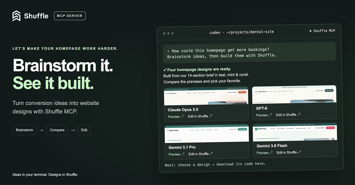
Meet Shuffle’s MCP server ✨
Ask Codex or Claude in your project, “How can I make the homepage convert better?”, then brainstorm, generate new designs with Shuffle right from your terminal, compare previews and bring the code you like straight into your project. (Read more)