Browse 1,117 ready-made components from the Solstice UI library. Every variant is fully responsive – copy the code or customize it in the visual editor and export clean code.
Newsletter Subscribe Section with Study Session Illustration
A split-screen newsletter signup section with a "Newsletter" badge, a large "Subscribe" heading, supporting text, an email input, and an orange subscribe button. The left side shows an illustrative app mockup of a study session with lesson cards and images.
Blog Article Page with Hero Image and Newsletter Signup
A single blog post layout with a back link, full-width hero photo, centered date and read time, large article title, and multi-section body text. It ends with a newsletter subscription callout and an author byline with a share button.
Pricing section with Free and Infinity plans, billing toggle, and FAQ
A pricing section that compares a free plan and an orange-highlighted Infinity plan at $0 and $4 per month, with a monthly/annually billing toggle above and a Pricing FAQs grid below. Each plan card lists features with orange or white check icons and a call-to-action button.
Weekly Online Events Calendar Section with Sign-up CTA
A marketing section headed "Engage in our weekly online events" containing a weekly calendar view for August 2023 with Today and previous/next navigation, colored event cards, and an info panel explaining how to join with a "Sign up now" button. The layout stacks the heading, calendar card, and CTA box vertically on a light background.
Virtual Math Study Session Room with Timer and Todo Overlay
A collaborative study room interface showing a shared 3D scene with a floating study timer, a todo checklist with progress indicator, a participant count badge, and a video tile of a participant. The top bar displays participant avatars, a screen-sharing indicator, and an Invite button.
Student testimonials carousel with heading and review cards
A light-background testimonials section with a centered two-line heading above a horizontal row of student review cards, each showing an avatar, name and role, and quotation text. A progress bar below indicates carousel position, and one card is emphasized with larger text.
A horizontally scrolling, two-row logo carousel with gray placeholder logos in rounded cards, introduced by the caption "Backed by leading education companies". Logos are cropped at both edges, indicating a marquee-style social proof section.
<section class="pb-32">
  <div class="border-b border-gray-100 pb-16 pt-24">
    <div class="container mx-auto px-4">
      <div class="rounded-md border border-orange-100 bg-orange-50 px-2 py-1 uppercase text-orange-500 text-sm font-medium inline-block mb-4">CAREERS</div>
      <h1 class="text-3xl lg:text-5xl font-bold font-heading">Careers at Solstice</h1>
    </div>
  </div>
  <div class="container mx-auto px-4">
    <h2 class="text-3xl font-bold font-heading mb-4 mt-16">What we’re building</h2>
    <div class="flex flex-wrap mb-16 -mx-4">
      <div class="w-full lg:w-2/3 p-4">
        <p class="text-gray-600">People are shifting to a new form of collaboration in distributed teams and are wasting too much effort connecting the dots between different work streams to understand the bigger picture. Solstice is building a work hub that gives people a radically simpler way to coordinate work across teams and get context on what’s happening.</p>
      </div>
      <div class="w-full lg:w-1/3 p-4">
        <p class="text-gray-600">By bringing structure, access, and efficiency to teamwork. Backed by Atomico, Salesforce Ventures, and Mosaic, we’re on a mission to unlock the collective potential of teams and would love for you to join us!</p>
      </div>
    </div>
    <div class="flex flex-wrap mb-4 -mx-4">
      <div class="w-full lg:w-2/3 p-4">
        <img class="w-full object-cover rounded-3xl" src="solstice-assets/images/careers/picture1-large.png" alt="">
      </div>
      <div class="w-full lg:w-1/3 p-4">
        <img class="w-full object-cover rounded-3xl" style="height:550px;" src="solstice-assets/images/careers/picture1.png" alt="">
      </div>
Get the code for 13,400+ components
Create a free account to copy production-ready code from every component in the library.
Free account · No credit card · No password needed
Careers page with intro, photo collage, benefits grid, and open roles list
A light-background careers page for Solstice featuring a header, an introductory text section, a mosaic of team photos, a three-column benefits grid with icons, and a list of open job cards with remote and full-time badges. It ends with a call-to-action row to email a resume.
FAQ Section with Category Tabs and Expandable Questions
A light-themed FAQ section with a centered heading and subtitle, followed by pill-shaped category tabs (General, Community, Pricing) and a vertical list of expandable question rows with orange plus icons. The layout is centered and stacked, with rounded outlined rows.
Blog Index with Featured Article and Paginated Article Card Grid
A blog listing page with an orange hero heading, a featured article card with image, a "Latest articles" section divider, a three-column grid of article cards with tags, titles, excerpts and metadata, and Prev/Next pagination controls. Content is organized in a clean, light-background layout beneath the orange header.
How It Works Three-Step Onboarding Section with Yoga Background
A marketing section headed by an eyebrow label and large question heading, followed by a full-width photographic background of a yoga mat with three overlapping white step cards numbered 1 to 3 for account creation, joining a room, and starting learning. The layout uses staggered card placement over a warm, blurred scene.
Company About Page with Mission, Stats, Values, Investors, and Team
A marketing about-us page for an education company, opening with a large heading, a four-stat summary bar (founded, funding, team size, nationalities), a values section with photos and a checklist, an investor logo grid, and a team section with portrait cards. Light background with orange accents and generous spacing.
Discover our features feature grid with study room, community, summaries, events, and progress cards
A marketing feature section headed "Discover our features" that presents five illustrated cards in a mosaic layout, each showing an app screenshot or mockup for study rooms, community members, note summaries, events and discussions, and progress tracking. The section promotes a learning product through illustrative UI rather than interactive controls.
Centered Call-to-Action Hero with Four Photo Cards
A centered marketing call-to-action section with a bold two-line heading inviting visitors to join and learn together, a single orange Sign Up Now button, and four rounded portrait photo cards placed at the corners. The light background and sparse arrangement give it a minimal, spacious appearance.
Split-screen sign up form with email, password, and Google sign-up
A two-column sign up page with a left-side form containing email and password fields, an orange primary Sign Up button, and a Google sign-up option, plus a light gray right panel displaying a white decorative logo mark. The form is aligned to the left column and includes a link to log in for existing users.
This page displays only component screenshots and code. Switch to "Code" to copy it or click "Open in Editor" to customize it.
The easiest way to create
beautiful
websites
What's new
See what you're getting before you commit. We ship new updates every day.
The AI Agent just got a lot more powerful
Describe what you need in one chat and the Agent does the rest: it adds new sections, edits copy and styles, moves blocks around or removes them across your whole page. No modes, no switching, just tell it what to change.
Multi-AI Designer can now regenerate designs
Not quite there yet? Ask for tweaks like missing assets, your logo or other details, and regenerate the design without starting from scratch.
Meet Shuffle’s MCP server ✨
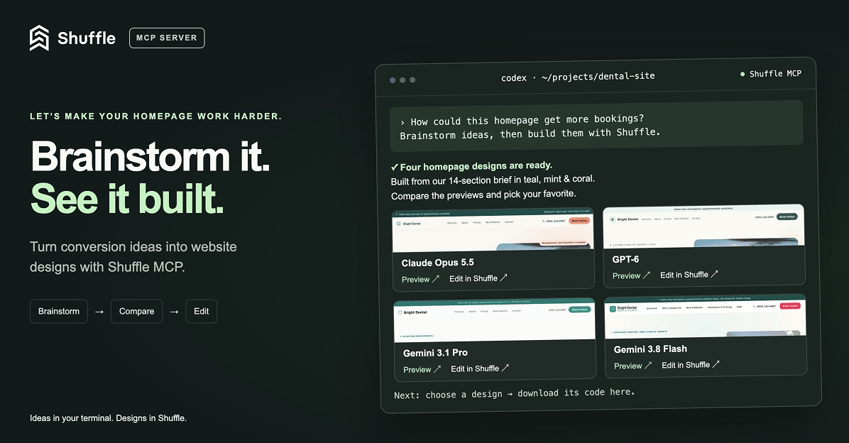
Ask Codex or Claude in your project, “How can I make the homepage convert better?”, then brainstorm, generate new designs with Shuffle right from your terminal, compare previews and bring the code you like straight into your project. (Read more)