Can't find the right component?
Describe it and Shuffle AI builds it in seconds, ready to edit and export.
Browse 11 ready-made logo clouds components from the Uinel UI library. Every variant is fully responsive – copy the code or customize it in the visual editor and export clean code.
Create a free account to copy production-ready code from every component in the library.
Free account · No credit card · No password needed
Already have an account? Sign in
A dark navy hero section with a split layout: a circular orbit graphic on the left displays brand logos (Spotify, Dropbox, Slack, and others) around a central hexagon icon, while the right side presents a "More brands" pill button, a large heading "Trusted by brands all over", and supporting paragraph text. The design uses concentric orbit rings and decorative colored dots for emphasis.
Choose from 11 variations of Logo clouds UI components. Presented here are variants available in Uinel library.
You will also find many other types of components in Shuffle Editor that will be in the same style. Each library has been designed by a professional designer and coded by our team of developers.
Get access to all Logo clouds UI components, code and our visual editor. Try the demo for free!
See what you're getting before you commit. We ship new updates every day.
Describe what you need in one chat and the Agent does the rest: it adds new sections, edits copy and styles, moves blocks around or removes them across your whole page. No modes, no switching, just tell it what to change.
Not quite there yet? Ask for tweaks like missing assets, your logo or other details, and regenerate the design without starting from scratch.
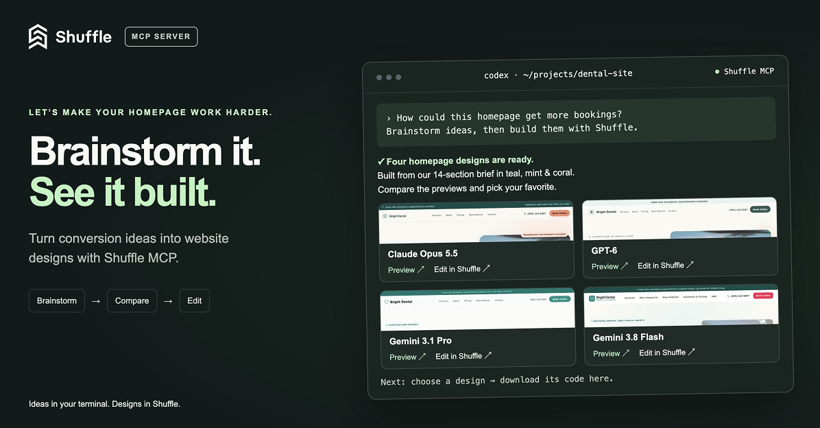
Ask Codex or Claude in your project, “How can I make the homepage convert better?”, then brainstorm, generate new designs with Shuffle right from your terminal, compare previews and bring the code you like straight into your project. (Read more)
© 2026 Shuffle. All rights reserved.