Can't find the right component?
Describe it and Shuffle AI builds it in seconds, ready to edit and export.
Browse 244 ready-made components from the Nightsable UI library. Every variant is fully responsive – copy the code or customize it in the visual editor and export clean code.
Create a free account to copy production-ready code from every component in the library.
Free account · No credit card · No password needed
Already have an account? Sign in
Components are just the start. See how a project goes from prompt to production‑ready code with Shuffle.
A dark marketing section promoting the Nightsable app, featuring a tilted phone mockup showing a balance and crypto asset cards on the left, and a heading, short description, and App Store and Google Play download badges on the right. The lime-green eyebrow label and star accent add a single highlight against the dark background.
Create a free account to copy production-ready code from every component in the library.
Free account · No credit card · No password needed
Already have an account? Sign in
Components are just the start. See how a project goes from prompt to production‑ready code with Shuffle.
A dark split-screen sign-up component with a left column containing Google and Apple social sign-up buttons, an email field, and a lime Sign up button, plus a sign-in link. The right column shows an illustrative portfolio card and a "Trusted by" logo strip.
Create a free account to copy production-ready code from every component in the library.
Free account · No credit card · No password needed
Already have an account? Sign in
Components are just the start. See how a project goes from prompt to production‑ready code with Shuffle.
A dark-themed blog section with a centered eyebrow label and 'Blog' heading above a horizontal row of article cards, each showing a photo, title, excerpt, author avatar, name, and read time. Cards extend past the viewport edges, suggesting a horizontally scrolling carousel.
Create a free account to copy production-ready code from every component in the library.
Free account · No credit card · No password needed
Already have an account? Sign in
Components are just the start. See how a project goes from prompt to production‑ready code with Shuffle.
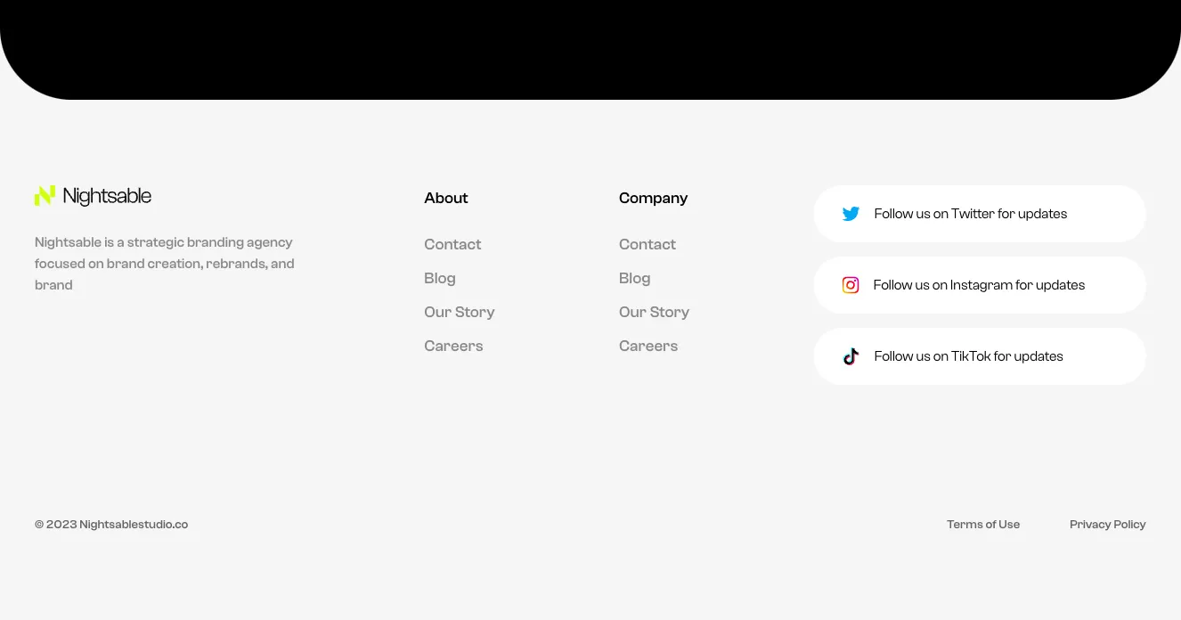
A light-background website footer for the Nightsable branding agency, showing a logo and tagline, About and Company link columns, three white pill-shaped social follow cards for Twitter, Instagram, and TikTok, and a copyright line with Terms of Use and Privacy Policy links at the bottom. The black rounded shape at the top is a separate section above the footer.
Create a free account to copy production-ready code from every component in the library.
Free account · No credit card · No password needed
Already have an account? Sign in
Components are just the start. See how a project goes from prompt to production‑ready code with Shuffle.
A centered dark contact card featuring a circular profile photo overlapping the top edge, a name heading, a date line, and phone and email contact rows with lime-green line icons. The rounded outlined container has a subtle glow at its bottom edge.
Create a free account to copy production-ready code from every component in the library.
Free account · No credit card · No password needed
Already have an account? Sign in
Components are just the start. See how a project goes from prompt to production‑ready code with Shuffle.
A horizontal row of three large white statistic figures ($1.5B+, 100+, 75%) on a near-black background, each with a small descriptive caption below and thin vertical dividers between them. It functions as a marketing social-proof section highlighting company scale.
Create a free account to copy production-ready code from every component in the library.
Free account · No credit card · No password needed
Already have an account? Sign in
Components are just the start. See how a project goes from prompt to production‑ready code with Shuffle.
A centered contact section on a near-black background with a small green eyebrow label, a large headline inviting partnership, a short descriptive paragraph, and a two-column form with name, email, company, and location fields. A full-width lime submit button and a small privacy notice appear below the form.
Create a free account to copy production-ready code from every component in the library.
Free account · No credit card · No password needed
Already have an account? Sign in
Components are just the start. See how a project goes from prompt to production‑ready code with Shuffle.
A dark testimonial section titled 'What people are saying' featuring a single customer quote from Wade Warren, CEO of GTIS Partners, beside a photo portrait. Previous and next circular arrow buttons sit at the lower right for navigating between testimonials.
Create a free account to copy production-ready code from every component in the library.
Free account · No credit card · No password needed
Already have an account? Sign in
Components are just the start. See how a project goes from prompt to production‑ready code with Shuffle.
A dark-themed pricing section titled "Compare our plans" with a monthly/annual billing switch and two side-by-side plan cards showing price per month, included features with checkmarks, and a lime "Start now" button. The layout is a centered heading followed by a two-column grid of plan cards.
Create a free account to copy production-ready code from every component in the library.
Free account · No credit card · No password needed
Already have an account? Sign in
Components are just the start. See how a project goes from prompt to production‑ready code with Shuffle.
A dark-themed team section with a small lime eyebrow label, large 'Our Team' heading, and a row of four circular portrait cards showing name and role. A lime circular next arrow button overlays the fourth card, indicating a horizontal carousel.
Create a free account to copy production-ready code from every component in the library.
Free account · No credit card · No password needed
Already have an account? Sign in
Components are just the start. See how a project goes from prompt to production‑ready code with Shuffle.
A dark-themed careers section titled "Open positions" with horizontal department filter tabs above a table listing position, department pill badges, commitment, and location. A lime-green full-width button below the table links to all positions.
Create a free account to copy production-ready code from every component in the library.
Free account · No credit card · No password needed
Already have an account? Sign in
Components are just the start. See how a project goes from prompt to production‑ready code with Shuffle.
A single-line notification with an exclamation icon and message asking the user to confirm their email address before viewing content. It uses a rounded gray pill container on a dark background, with light text and no visible action buttons.
Create a free account to copy production-ready code from every component in the library.
Free account · No credit card · No password needed
Already have an account? Sign in
Components are just the start. See how a project goes from prompt to production‑ready code with Shuffle.
A dark-themed FAQ section with a small green eyebrow label, a large centered 'FAQ' heading, and four stacked expandable questions about money transfers, each marked with a chevron on the right. The layout is a centered vertical list with generous spacing.
Create a free account to copy production-ready code from every component in the library.
Free account · No credit card · No password needed
Already have an account? Sign in
Components are just the start. See how a project goes from prompt to production‑ready code with Shuffle.
A dark-themed long-form blog article page with a hero image and headline, a left-side table of contents with share controls, a main article body with quote, images and headings, and a 'From the blog' card grid of three related posts at the bottom.
Create a free account to copy production-ready code from every component in the library.
Free account · No credit card · No password needed
Already have an account? Sign in
Components are just the start. See how a project goes from prompt to production‑ready code with Shuffle.
A thin dark horizontal breadcrumb trail showing 'Homepage / Services' with the current page highlighted in brighter text. It appears to be a standalone navigation strip with no other visible controls.
Create a free account to copy production-ready code from every component in the library.
Free account · No credit card · No password needed
Already have an account? Sign in
Components are just the start. See how a project goes from prompt to production‑ready code with Shuffle.
A dark-themed marketing feature section with a small green eyebrow label, a large two-line heading, body copy, and three checkmark bullet points on the left, paired with an isometric illustration of a stacked fintech credit card on the right. The layout is a split screen with text on one side and a visual on the other.
Create a free account to copy production-ready code from every component in the library.
Free account · No credit card · No password needed
Already have an account? Sign in
Components are just the start. See how a project goes from prompt to production‑ready code with Shuffle.
A dark-themed blog section with a centered "Blog" heading and two post cards arranged side by side, a larger featured card on the left and a smaller one on the right. Each card shows an image, meta line with post type and read time, title, description, and pill-shaped tag buttons.
Create a free account to copy production-ready code from every component in the library.
Free account · No credit card · No password needed
Already have an account? Sign in
Components are just the start. See how a project goes from prompt to production‑ready code with Shuffle.
A dark overlay dialog titled Sign in with a close button, brand logo, email and password inputs, a lime Log in button, and a Forgot password link. The content is centered vertically in a single column.
Create a free account to copy production-ready code from every component in the library.
Free account · No credit card · No password needed
Already have an account? Sign in
Components are just the start. See how a project goes from prompt to production‑ready code with Shuffle.
A dark horizontal navigation bar showing the Nightsable logo with a lime-green mark on the left, four centered text links (Home, About us, Wallet, Blog), and a grid-dot menu icon on the right. The layout is a single row with minimal styling.
Create a free account to copy production-ready code from every component in the library.
Free account · No credit card · No password needed
Already have an account? Sign in
Components are just the start. See how a project goes from prompt to production‑ready code with Shuffle.
A centered testimonial section on a dark background showing a circular headshot avatar, a large multi-line quotation praising GTIS Partners, and attribution text with name and title. The layout is a single vertically stacked column with no navigation or interactive controls.
How you’ll build with Shuffle.
© 2026 Shuffle. All rights reserved.
See what you're getting before you commit.
Switch the editor to Grid and every page of your project appears side by side on one canvas. Arrange them freely, zoom in and out, and add as many new pages as you need in a few clicks.
Describe what you need in one chat and the Agent does the rest: it adds new sections, edits copy and styles, moves blocks around or removes them across your whole page. No modes, no switching, just tell it what to change.
Not quite there yet? Ask for tweaks like missing assets, your logo or other details, and regenerate the design without starting from scratch.