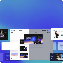
Browse 244 ready-made components from the Consulty UI library. Every variant is fully responsive – copy the code or customize it in the visual editor and export clean code.
 Consulty
Full Shuffle Editor access for just $10
Great for quick projects and for testing everything Shuffle can do. One-time payment, not a subscription.
Get 7-Day PassNew to Shuffle? Try our tools:

Create a free account to copy production-ready code from every component in the library.
Free account · No credit card · No password needed
Already have an account? Sign in
A full-width hero section with a dark top navigation bar and a large headline over a photographic background of a seated person using a laptop. It includes a subtitle, primary orange and secondary white call-to-action buttons, and a row of three tab-style labels at the bottom.

Create a free account to copy production-ready code from every component in the library.
Free account · No credit card · No password needed
Already have an account? Sign in
A dark-background hero section for a consulting company, featuring a large left-aligned headline, right-aligned intro paragraph, a circular orange badge with rotated text, and a full-width photograph of people collaborating below. A top navigation bar with logo, menu items, and a call-to-action button sits above the hero.


Create a free account to copy production-ready code from every component in the library.
Free account · No credit card · No password needed
Already have an account? Sign in

Create a free account to copy production-ready code from every component in the library.
Free account · No credit card · No password needed
Already have an account? Sign in

Create a free account to copy production-ready code from every component in the library.
Free account · No credit card · No password needed
Already have an account? Sign in

Create a free account to copy production-ready code from every component in the library.
Free account · No credit card · No password needed
Already have an account? Sign in
A dark full-width section displaying three centered statistics (5.2M, 17k, 99%) with bold headings and short body text beneath each. A faint large decorative background graphic sits behind the content, with no visible controls or interactive elements.

Create a free account to copy production-ready code from every component in the library.
Free account · No credit card · No password needed
Already have an account? Sign in
A light-themed pricing section titled "Select a suitable plan" showing three side-by-side plan cards (Starter, Pro, Business) with pastel header bands, checkmark feature lists, one-time prices, and "Choose This Plan" buttons, with the Pro button filled black as the highlighted option. A row of trust labels (Secure Checkout, Satisfaction Guaranteed, 24/7 Async Support) sits below the cards.

Create a free account to copy production-ready code from every component in the library.
Free account · No credit card · No password needed
Already have an account? Sign in
A minimal section headed "Our Awards" that lists five awards as stacked rows separated by thin dividers, each showing a year, award name, short description, and a trailing arrow icon. The layout is a vertical list with no imagery or interactive controls visible beyond the arrow icons.

Create a free account to copy production-ready code from every component in the library.
Free account · No credit card · No password needed
Already have an account? Sign in
A centered FAQ section on a light gray panel with a large heading, subtitle, four collapsible question rows marked with plus icons, and a closing prompt with a black "Talk to us" button. The layout is a vertically stacked, centered column of white accordion rows.

Create a free account to copy production-ready code from every component in the library.
Free account · No credit card · No password needed
Already have an account? Sign in
A horizontal site header showing the Consulty logo, a yellow 'We are hiring!' pill badge, text navigation links with dropdown indicators for Products and Resources, and outlined Sign In and filled black 'Get A Free Consultation' buttons on a light background.

Create a free account to copy production-ready code from every component in the library.
Free account · No credit card · No password needed
Already have an account? Sign in
A split-layout job listings section with a heading and short intro on the left and categorized job cards on the right, each showing title, status badge, location, salary range, and an Apply Now button. The light background and white cards with rounded corners distinguish it as a careers list.

Create a free account to copy production-ready code from every component in the library.
Free account · No credit card · No password needed
Already have an account? Sign in
A dark marketing section titled "Vision & direction" with a short paragraph and an outlined "Explore All Services" button on the left, and a rounded photo of a woman placing a sticky note on a whiteboard on the right. A black cutout overlay displays the numbered label "01 Strategy" and an arrow icon.

Create a free account to copy production-ready code from every component in the library.
Free account · No credit card · No password needed
Already have an account? Sign in
A full-width orange top banner displaying a short announcement message with an underlined inline link and a dismiss (close) icon on the right. The banner uses a subtle patterned background and sits above a plain light gray content area.

Create a free account to copy production-ready code from every component in the library.
Free account · No credit card · No password needed
Already have an account? Sign in
A split-screen marketing section pairing a portrait photo on a peach rounded panel, with a white badge showing the founding year 1994, beside an 'About our company' heading, short body text, and a black pill 'Read More About Us' call-to-action button. Content is left-aligned on a plain white background.

Create a free account to copy production-ready code from every component in the library.
Free account · No credit card · No password needed
Already have an account? Sign in
A marketing hero section with a large left-aligned heading and short supporting text above a horizontal row of rounded portrait photos of varying sizes, with a few solid color blocks as placeholders. It introduces a team on a light background and is intended for a SaaS or agency landing page.

Create a free account to copy production-ready code from every component in the library.
Free account · No credit card · No password needed
Already have an account? Sign in
A marketing hero section with a large two-line headline, short supporting paragraph, black pill call-to-action button, and a "159%" average revenue statistic on the left, paired with a rounded portrait photograph on the right. The layout is a clean split-screen on a white background.

Create a free account to copy production-ready code from every component in the library.
Free account · No credit card · No password needed
Already have an account? Sign in
A marketing grid showing five packaging photographs, with a central large card labeled Growth that headlines a conversion case study and includes a Read Full Story button. The layout uses three columns with the featured card centered and smaller image tiles on either side.

Create a free account to copy production-ready code from every component in the library.
Free account · No credit card · No password needed
Already have an account? Sign in
A light-themed contact section with a left-aligned heading and a form containing name, email, subject, and message fields plus a black rounded Send Message button. The right side shows a stacked collage of two rounded photographs, one of an interior space and one of a woman, arranged in a split-screen layout.

Create a free account to copy production-ready code from every component in the library.
Free account · No credit card · No password needed
Already have an account? Sign in
A black, rounded notification bar fixed near the bottom of a light gray page, displaying a cookie usage message with an underlined Cookie Policy link and a dismiss close icon. A thin orange bottom border and a faint decorative graphic on the right add visual accent.

Create a free account to copy production-ready code from every component in the library.
Free account · No credit card · No password needed
Already have an account? Sign in
A narrow black banner showing a small outlined star icon followed by the text 'Strategic Roadmapping' aligned to the right edge. It appears to be a cropped badge or tag label, with no other visible content to determine its full purpose.


Choose from 244 of ready-made UI components available in Shuffle Editor.
By subscribing to the editor, you get access to all of them.
The UI libraries are available in four frameworks - Tailwind CSS, Bootstrap, Bulma, and Material-UI (React). We divided them into components, under which there is clear code. In Shuffle Editor, you can build whole templates from them, editing styles, texts, images, and other features. You can also export them as code and work in your favorite IDE.

Build websites faster with an AI Visual Editor


© 2026 Shuffle. All rights reserved.
See what you're getting before you commit.
Switch the editor to Grid and every page of your project appears side by side on one canvas. Arrange them freely, zoom in and out, and add as many new pages as you need in a few clicks.
Describe what you need in one chat and the Agent does the rest: it adds new sections, edits copy and styles, moves blocks around or removes them across your whole page. No modes, no switching, just tell it what to change.
Not quite there yet? Ask for tweaks like missing assets, your logo or other details, and regenerate the design without starting from scratch.