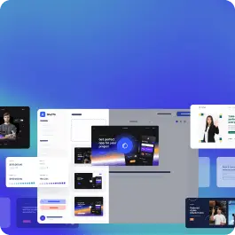
Browse 85 beautiful UI components — complete with full source code, visual editing, AI assistance, and more.
 Bulma
Bulma


Alerts are used to draw users' attention to a specific event. Therefore, they must properly stand out from the normal layout of the site. Bulma component alerts serve exactly this purpose, standing out with the chosen theme.
Browse and choose one variant from Bulma components alerts. They are UI library components created by our talented designers and coded by our development team.
Buy a subscription to get access to the drag and drop editor, all UI libraries and code under each component.
Build websites faster with an AI Visual Editor
© 2026 Shuffle. All rights reserved.


