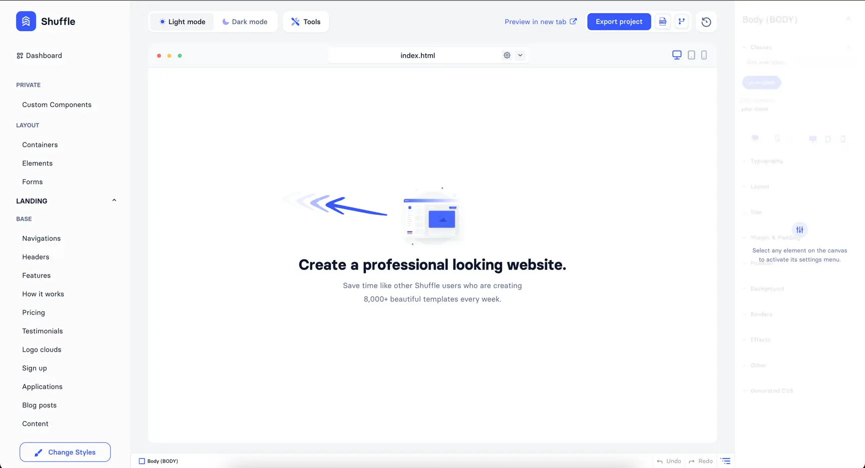
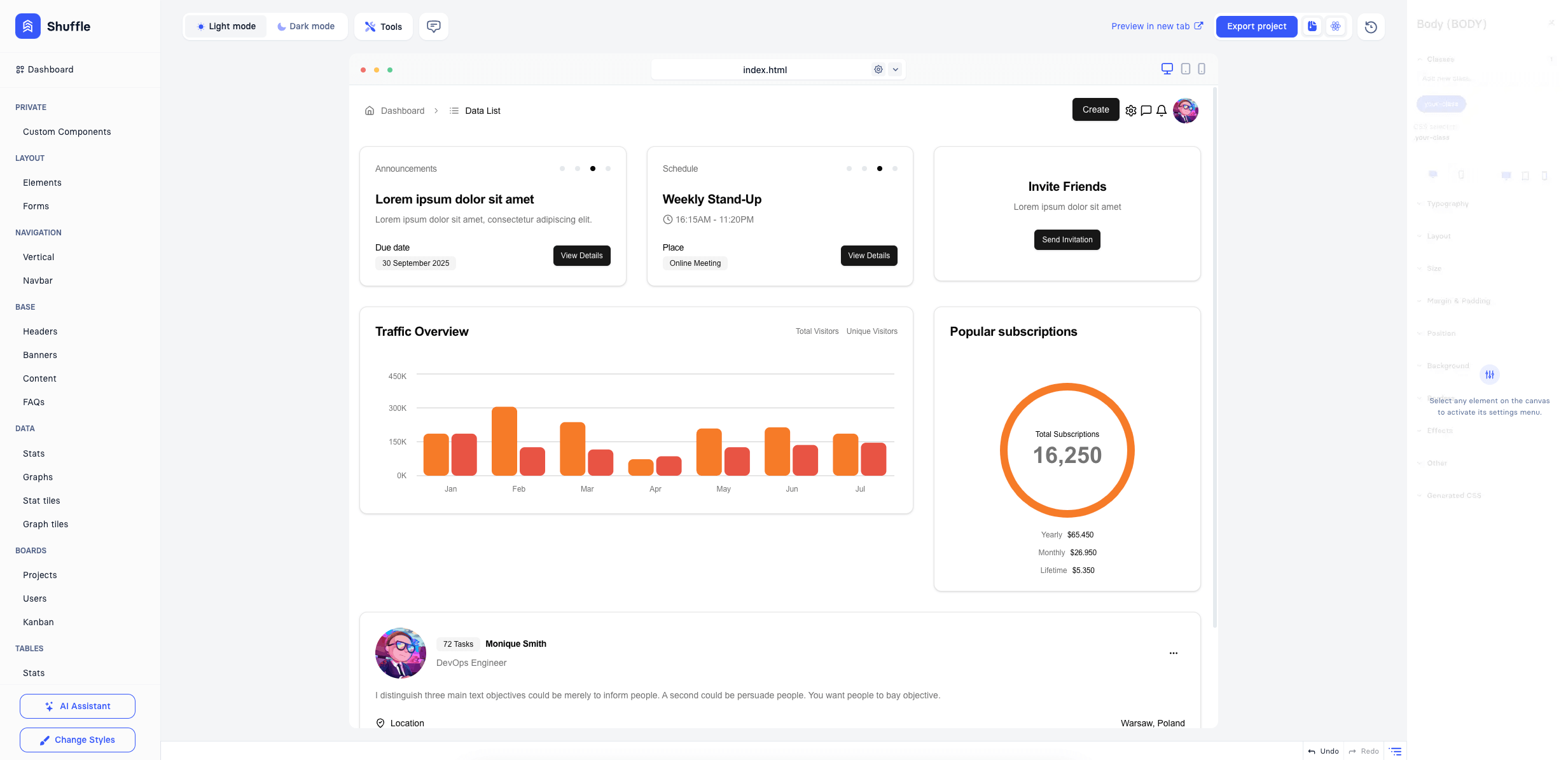
Here, you can view a quick overview of the main window of the editor:
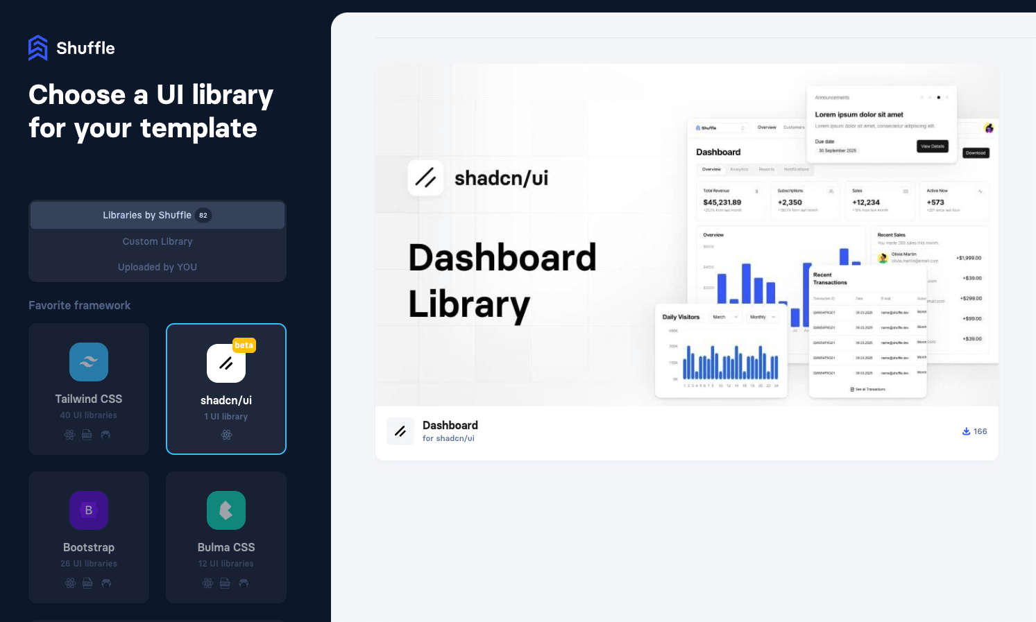
Shuffle supports shadcn/ui components in the editor, which the user can access similarly to other frameworks by selecting shadcn/ui when creating a new project. shadcn/ui is a components library based on Radix UI. Read more about shadcn/ui here.
Editing in shadcn/ui is similar to other libraries but with shadcn/ui components and:
Projects created with shadcn/ui can be exported similarly to other projects as a ZIP file, exported to the Git repository, or put on the server through FTP/SSH.
Users might use various components with shadcn/ui library available in the editor. In the editor, the user can use Custom React mode to edit components code and use custom code with custom-created components from supported ones.
Below, you can find a list of available shadcn/ui components.
You can also use Lucide icons in your project. To use them, you can search for the icon you want here.
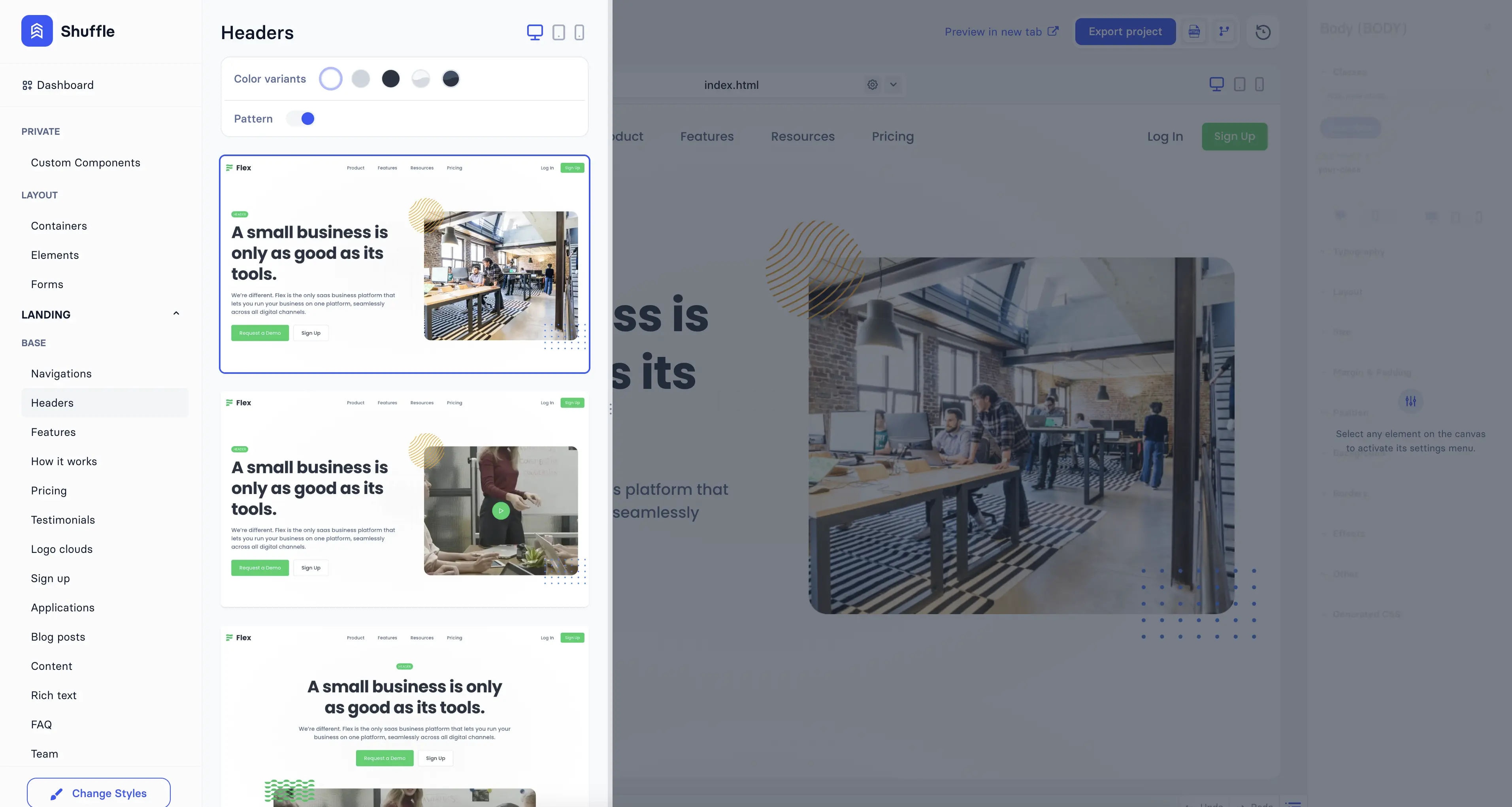
The components menu is located on the left side of the editor.
It expands when you hover over categories. Some libraries offer additional options like color variants or patterns. In the top right corner, you can find an RWD device switcher to view component previews in different screen sizes.
To add a component to the canvas, find the component you want to use and drag it to the canvas.
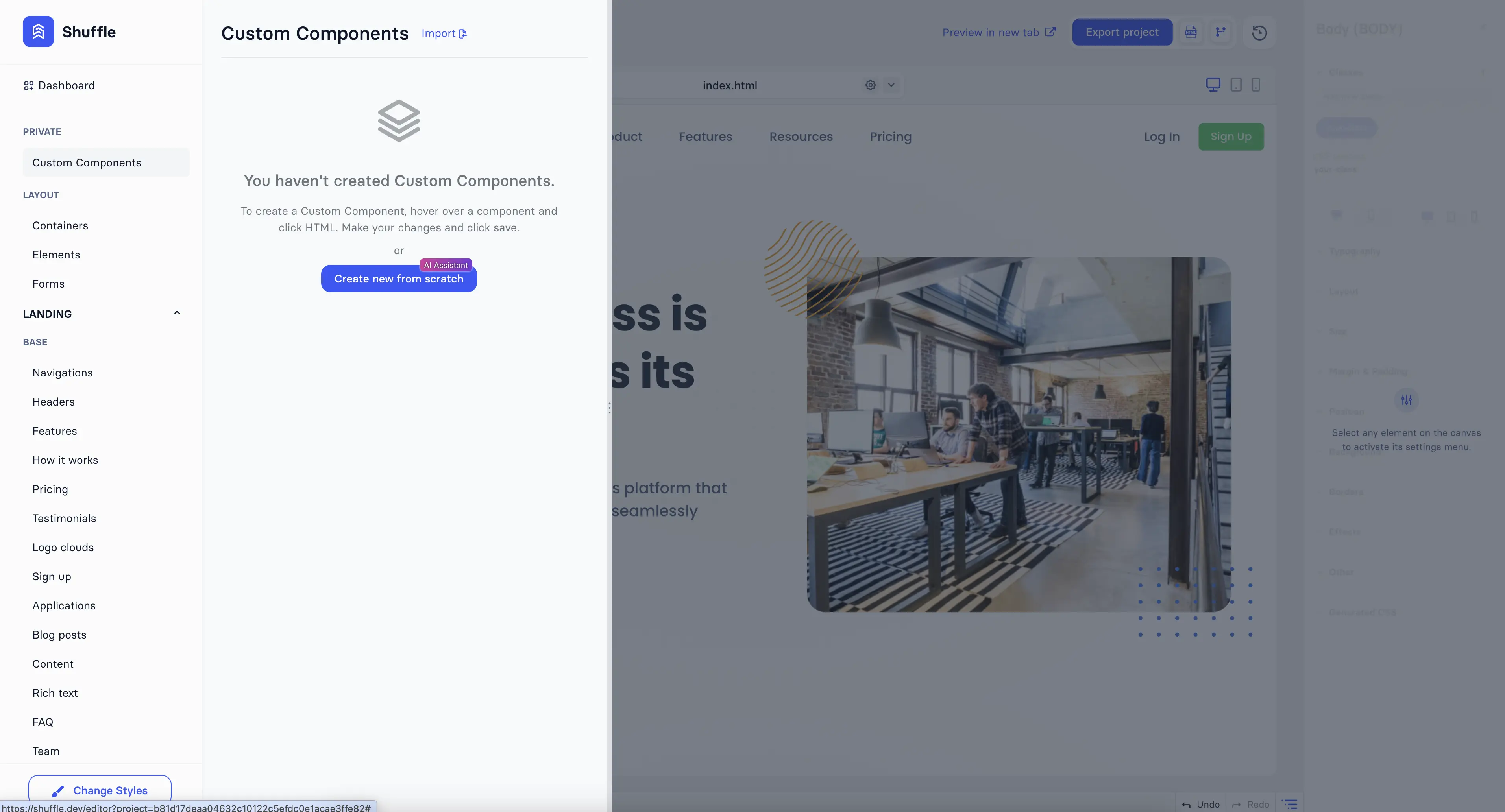
You can create your own components by making them from scratch or editing existing ones.
The first category in the Components menu is the project's custom components. They can be used in the same way as regular components.
You can import custom components from other projects, but only if they are from the same library.
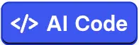
To edit any component, hover over it and click
 button.
Then, you will see the HTML editor with the component code. You can also use our AI Assistant to
generate new code or update existing.
button.
Then, you will see the HTML editor with the component code. You can also use our AI Assistant to
generate new code or update existing.
The AI Agent in Shuffle acts as your personal UI designer and code generator. It offers four powerful ways to help you build interfaces faster.
Text Prompt: Describe what you need in plain language (e.g., "top navigation with logo and CTA button") and the AI generates the corresponding UI code.
Image Upload: Upload a design mock-up from Figma or a rough sketch. The AI analyzes the visual structure and converts it into a functional, editable component.
Draw: Use the built-in drawing tool to sketch your idea manually. The AI processes your drawing to understand the layout and generates the appropriate code.
Chat: The Shuffle Assistant is a conversational builder that guides you through the creation process—asking clarifying questions, proposing pre-made elements, and generating custom designs based on the conversation.
Watch related video: Creating beautiful sections with Shuffle AI
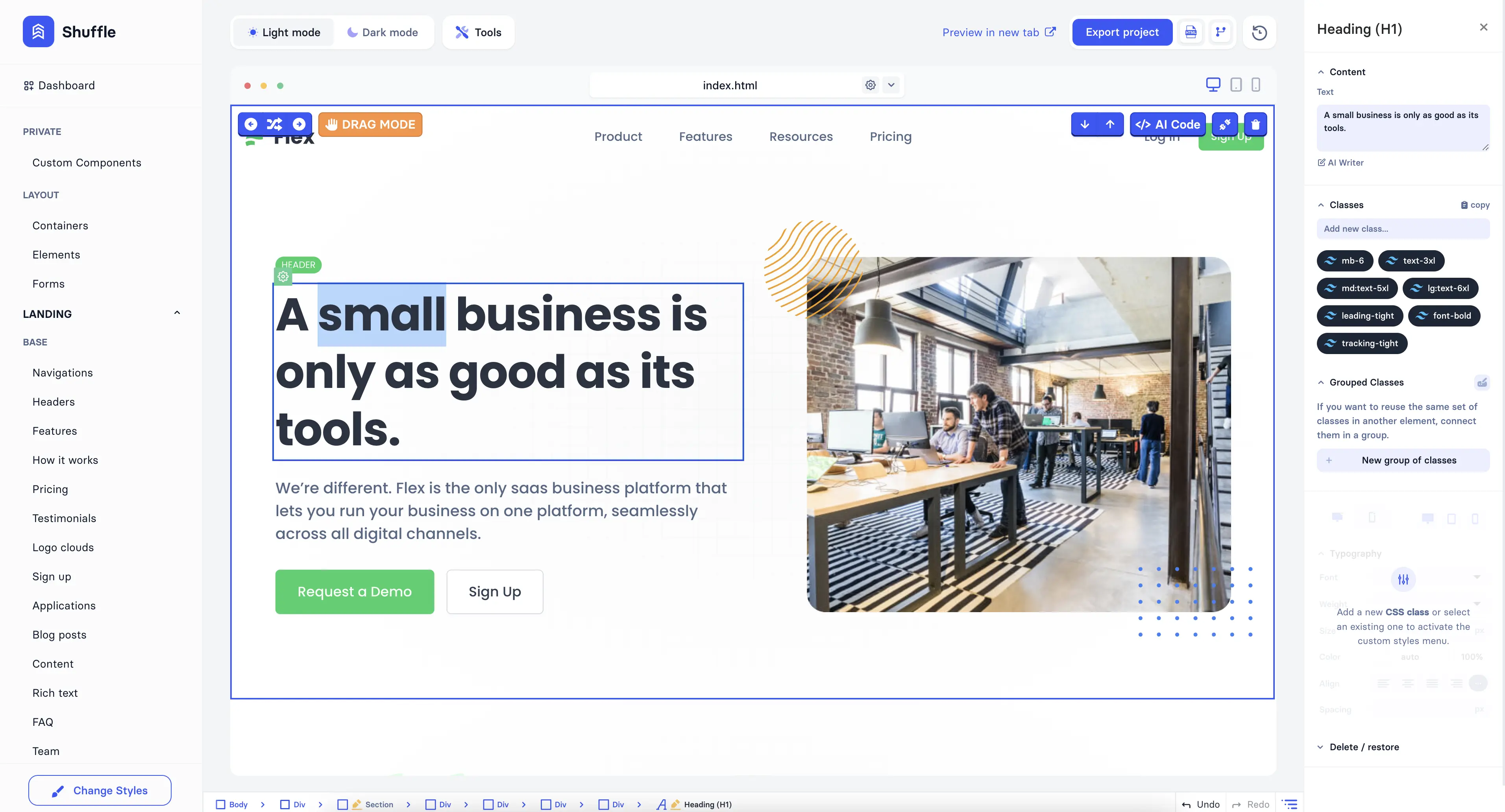
Text content can be edited directly on the canvas or from the right sidebar.
To start inline editing, double-click the text you want to edit and start typing. If you want to edit text from the right sidebar, click on the text element on the canvas and edit it in the right sidebar.
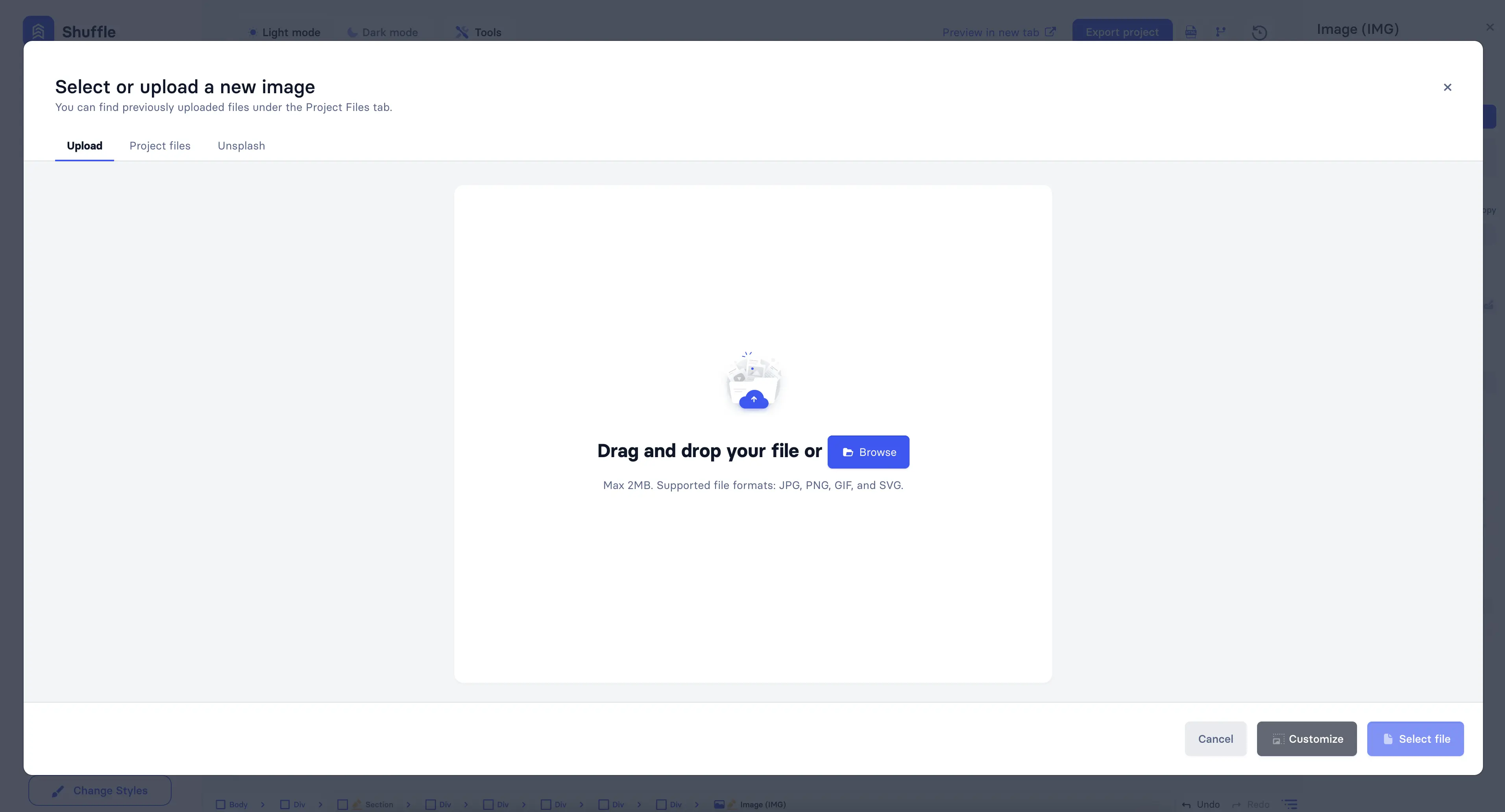
Images can be managed directly on the canvas or from the right sidebar. Shuffle offers both standard image management and AI-powered image generation capabilities.
Standard image management:
AI image generation:
Generate and edit images using AI models like Nano Banana / Nano Banana Pro (powered by Gemini). You can create images from text prompts, edit existing images by changing style, background, or colors, and use multiple reference images for generation. Once generated, upload the AI images to your project or paste them directly into components.
Watch related video: Nano Banana Pro by Google - Now seamlessly in Shuffle
Icons can be changed directly on the canvas or from the right sidebar.
To change an icon, double-click on it or click on the icon element on the canvas and change it in the right sidebar. Then, you can choose an icon from the library or upload a new one—the same way for images.
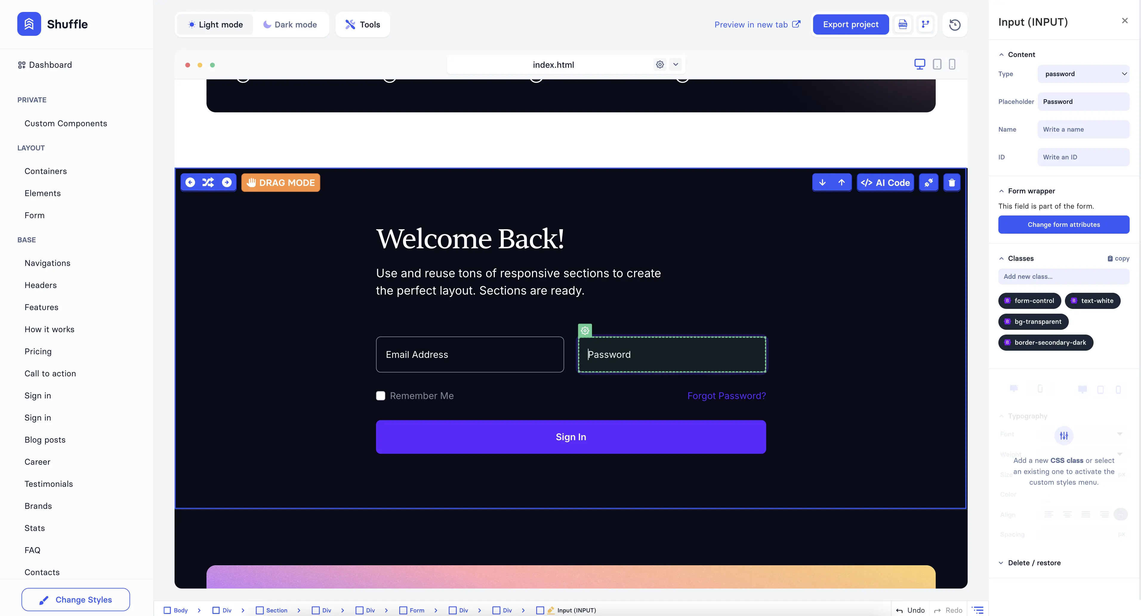
Forms elements can be customized in many ways.
To customize a form element, click the form element on the canvas and change it in the right sidebar. Depending on the form element, you can change its type, placeholder, label, and more.
The "Change form attributes" button will be available if the form element belongs to a form. When you click on it, the form will be selected, and you can change its attributes.
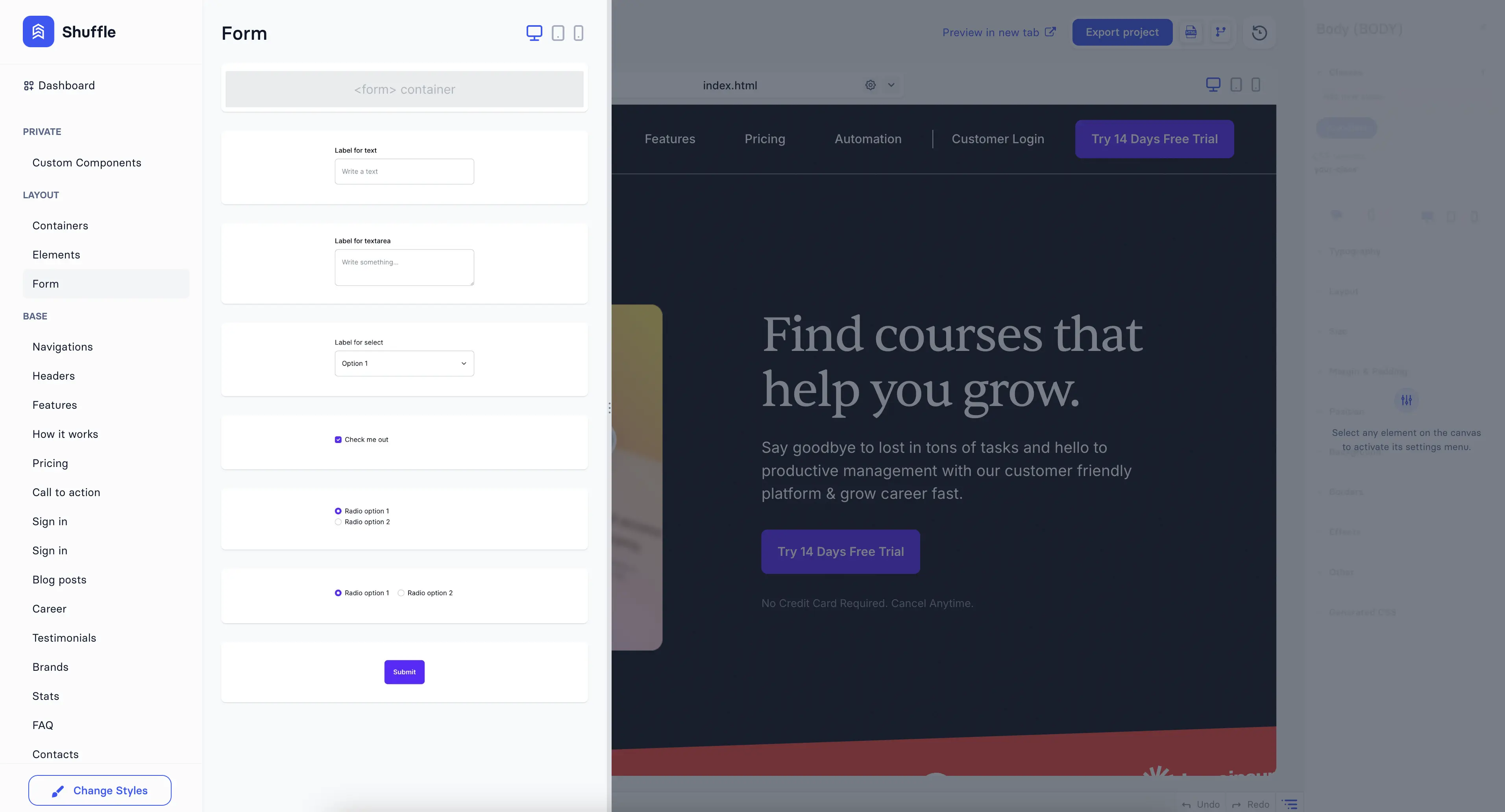
Low-level elements like div, span, button, etc., are available from the left sidebar.
To add a low-level element to the canvas, click on the element you want to add and drag it to the canvas.
Note: To add a low-level element to an existing component, you must enable Drag mode, which is available in the top left corner of the hovered component.
Any element on the canvas can be removed.
To remove an element from the canvas, click on the element you want to remove and press the delete key on your keyboard. Alternatively, you can click on the element and choose the "Delete" option from the right sidebar or open the context menu by clicking the COG icon on the element and choosing "Delete."
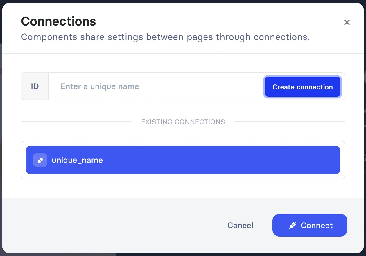
Components of the same type can be connected.
Component connections mean that they share the same data (text, image, icon, etc.).
To connect components, just click
 on the first
component and provide a connection name.
Then on the second component, click the same button
()
and choose an already-created connection.
on the first
component and provide a connection name.
Then on the second component, click the same button
()
and choose an already-created connection.
You can connect as many components as you want. Connected works between pages make it worthwhile for components like menus, headers, footers, etc.
To disconnect components, click
 on
the connected component and choose the "Disconnect" option.
on
the connected component and choose the "Disconnect" option.
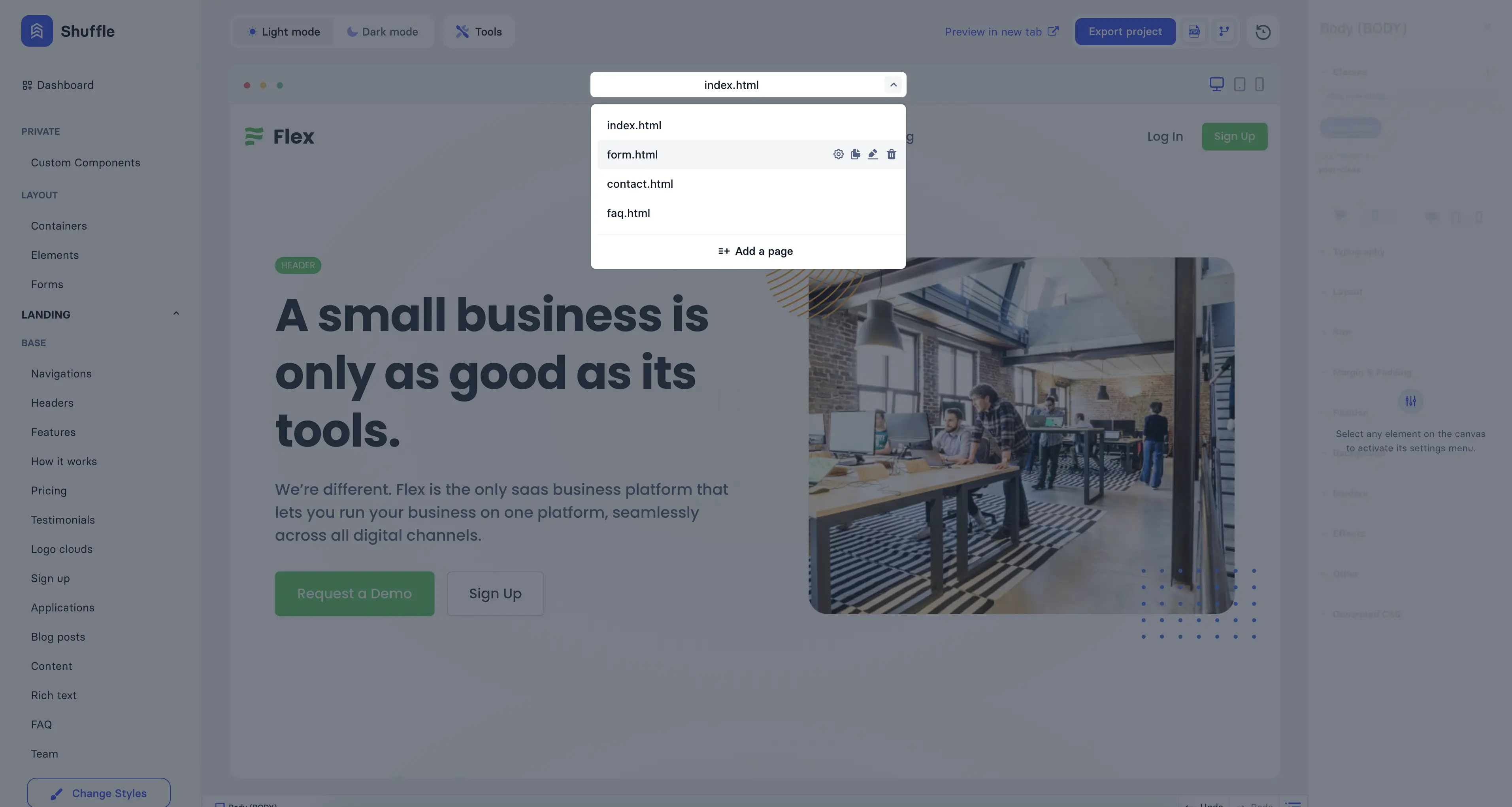
You can add, remove, duplicate, and rename pages.
To manage pages, use the dropdown menu just above the canvas. After the menu expands, you can see all the pages. To add a new page, click "Add a page." To rename a page, click the "pencil" icon next to the page name. To remove a page, click the "trash" icon. To duplicate a page, click the "duplicate" icon. To enter page settings, click the "cog" icon.
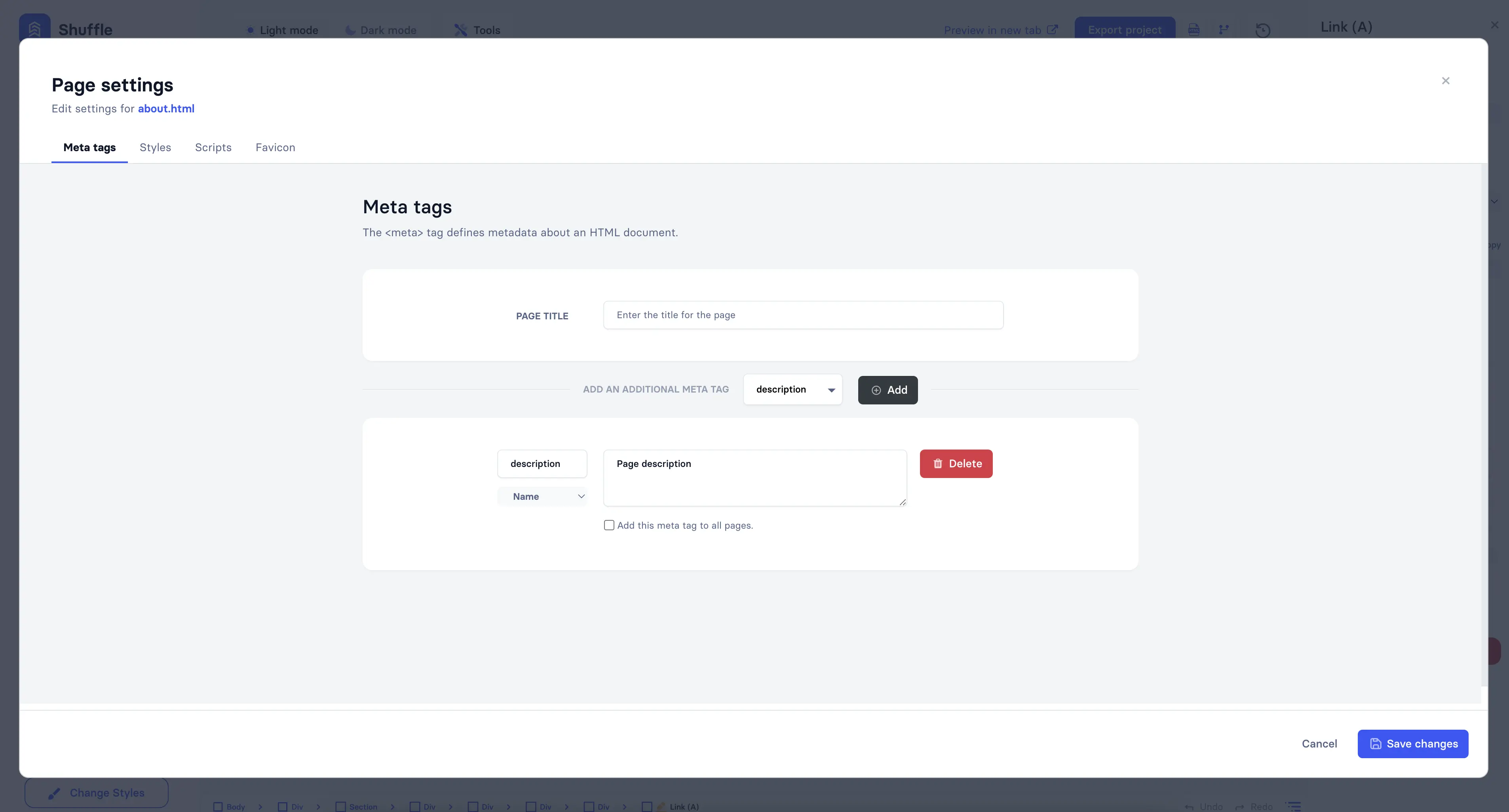
Page settings allow you to change meta tags and add external resources.
Note: you can't rename and remove the index.html page.
Meta tags can be added to the page.
You can add page titles, descriptions, keywords, and more in meta tags. Just choose the meta tag type and click Add. Then, provide a value for the meta tag. You can also remove meta tags by clicking on the Delete button.
To add the meta tag to all pages, use the "Add this meta tag to all pages" option.
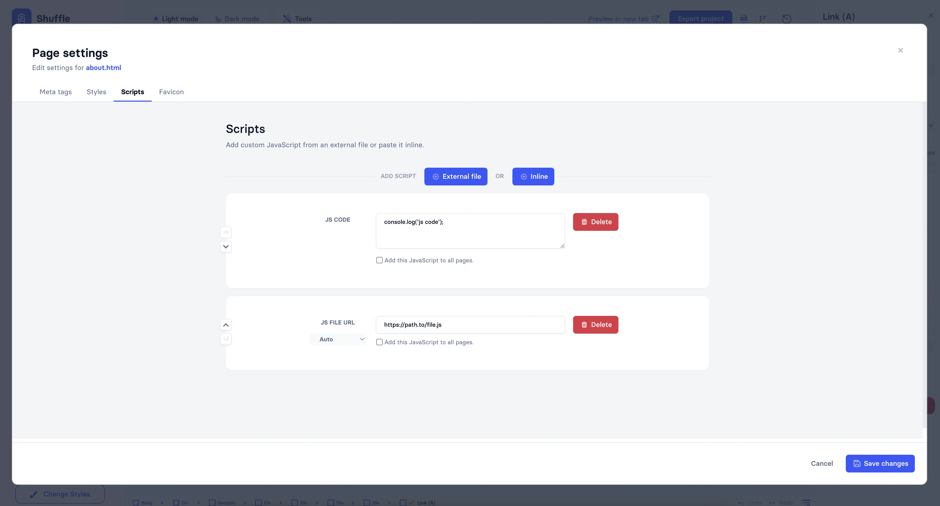
External resources such as scripts, stylesheets, or favicon can be added to the project.
To add an external resource, choose the resource type and click "External file" or "Inline." An external file allows you to add a link to the resource, while an Inline option allows you to add the resource directly to the project. You can also remove the resource by clicking the Delete button.
You can add external resources to all pages by using the appropriate option.
Favicons can be added only by clicking the "Select file" button. You can't add a favicon by providing a link.
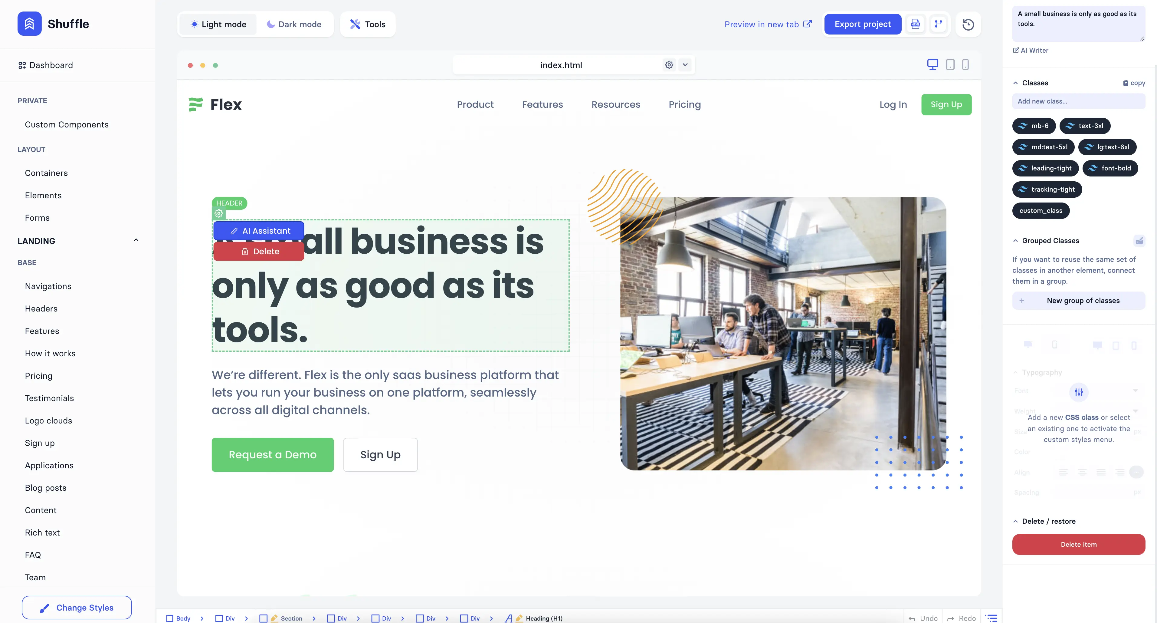
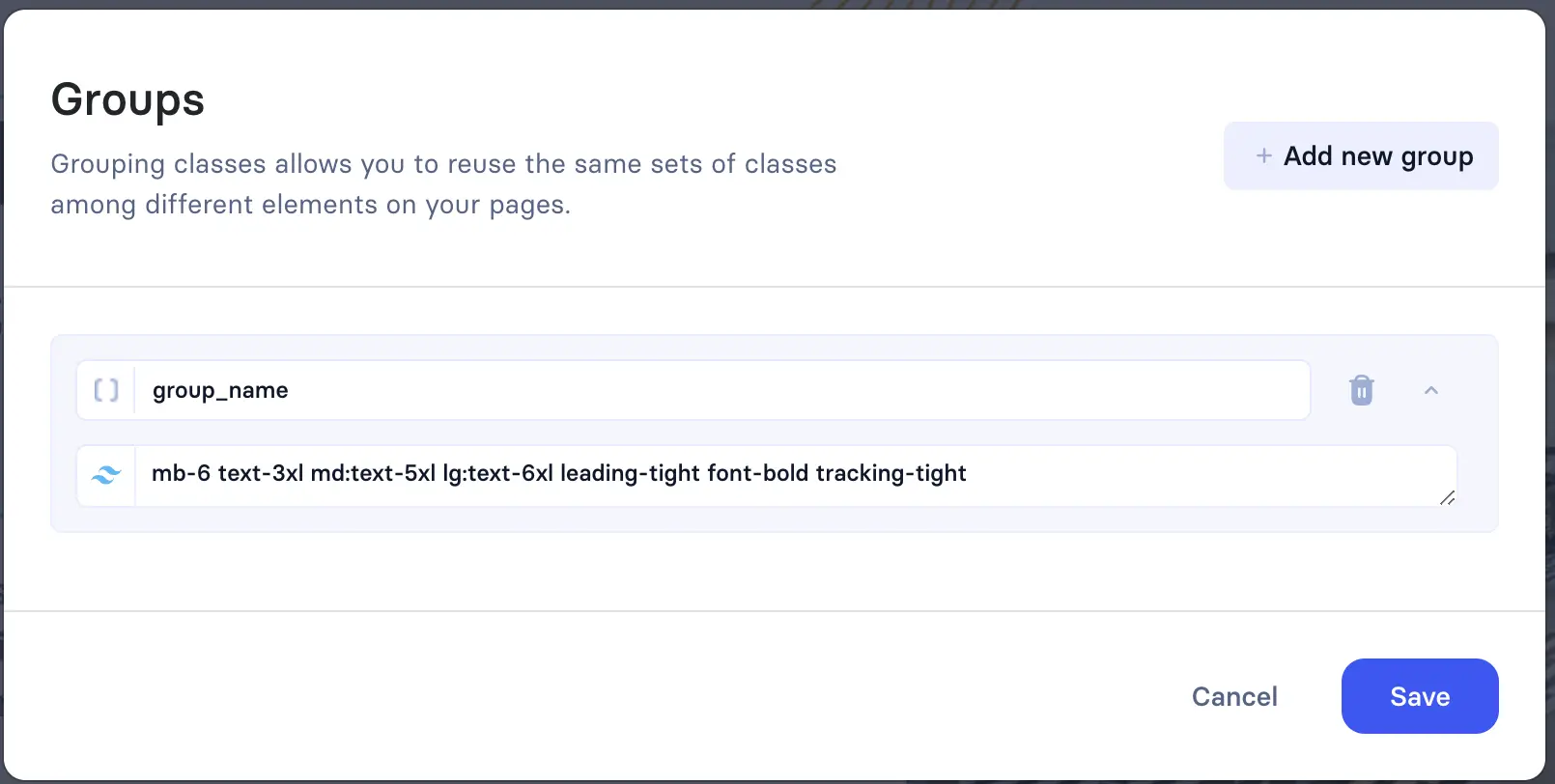
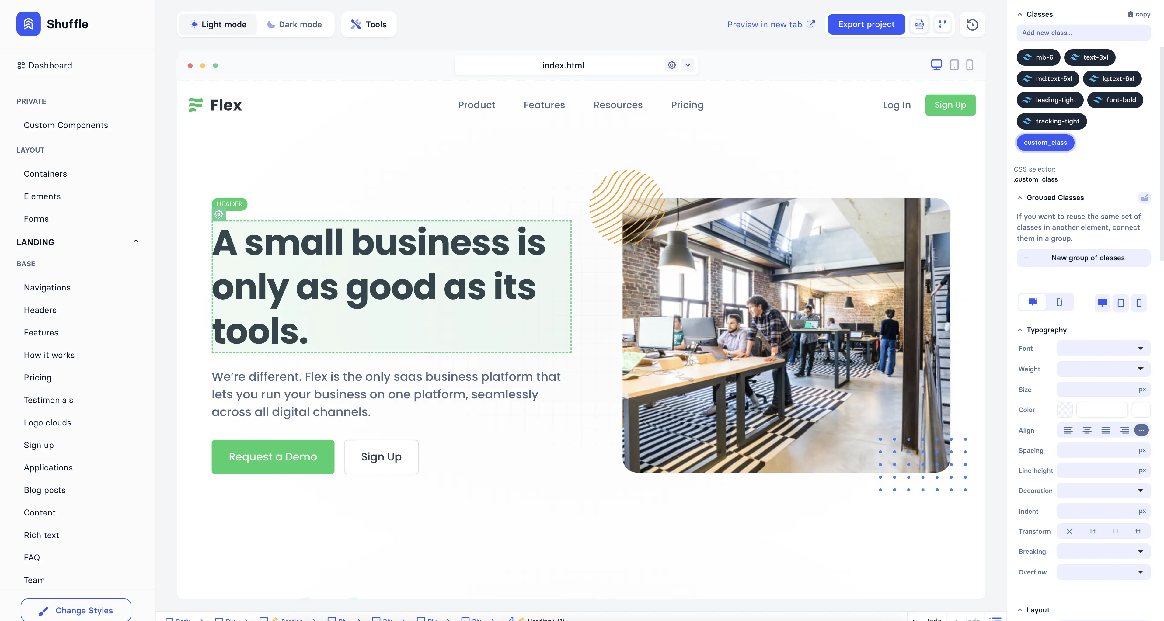
To reuse a set of classes between HTML elements, you can create grouped classes and use them instead of regular classes.
Use the "Grouped classes" option in the right sidebar to create a new group of classes. Then, you can add or delete classes from the group. Click on the class group name to add it to the element.
You can add custom classes to your project and customize it.
To add a custom class to an element, click on the element you want to add a class to and add a class in the right sidebar. Then, you can edit the class in the right sidebar. You can change typography, colors, margins, paddings, and more.
You can preview your project at any stage of the project creation.
If the preview provided by the editor is not enough, you can always use the "Preview in new tab" option to see your project in a new tab.
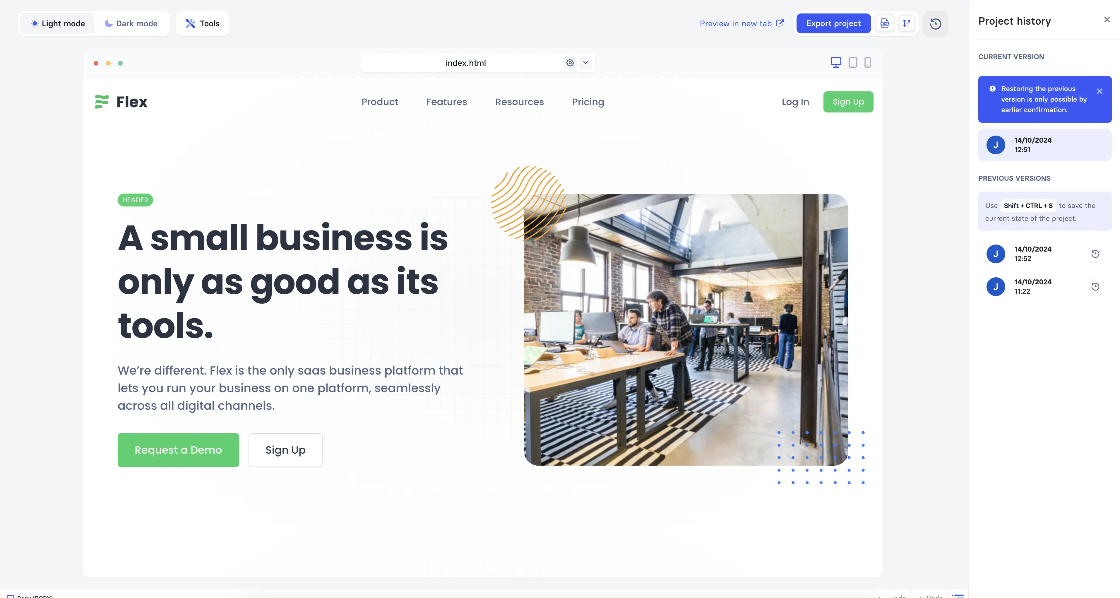
You can see the project history and revert changes from snapshots.
To see the project history, click on the "History" button ("arrow clock" icon) in the top right corner above the canvas. In the right sidebar, you can see all the snapshots. To view one of the previous versions, click on the snapshot you want. Then, you can revert changes by clicking the "Restore" button near the snapshot.
Build websites faster with an AI Visual Editor
© 2026 Shuffle. All rights reserved.


