Browse 8 ready-made UI components available in Shuffle Editor.
 Material-UI
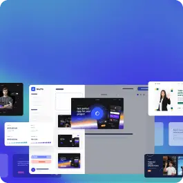
 Nereus


Choose from 8 variations of Material-Ui Hero section components. Presented here are variants available in Nereus library.
Get access to all Material-Ui Hero section components, code and our visual editor. Try the demo for free!
Build websites faster with an AI Visual Editor
© 2026 Shuffle. All rights reserved.


