Browse 8 beautiful UI components — complete with full source code, visual editing, AI assistance, and more.
 Material-UI


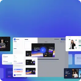
A well-designed price list determines the conversion rate. That's why in Shuffle Editor we give you access to very many variants of thoughtfully designed Material-Ui pricing components.
Each Material-Ui pricing component variant is a UI library component. We select the best designers to create our libraries, and the code underneath them is created by our in-house development team. Therefore, our libraries meet your needs, allowing you to create complete and functional Material-Ui UI templates.
Get access to all Material-Ui pricing components, code and our editor. Try the demo for free!
Build websites faster with an AI Visual Editor
© 2026 Shuffle. All rights reserved.


