Browse 5 ready-made UI components available in Shuffle Editor.
 Bulma
Bulma
 Bendis


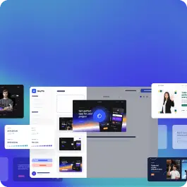
Choose from 5 variations of Bulma HTTP codes components. Presented here are variants available in Bendis library.
Get access to all Bulma HTTP codes components, code and our visual editor. Try the demo for free!
Build websites faster with an AI Visual Editor
© 2026 Shuffle. All rights reserved.


