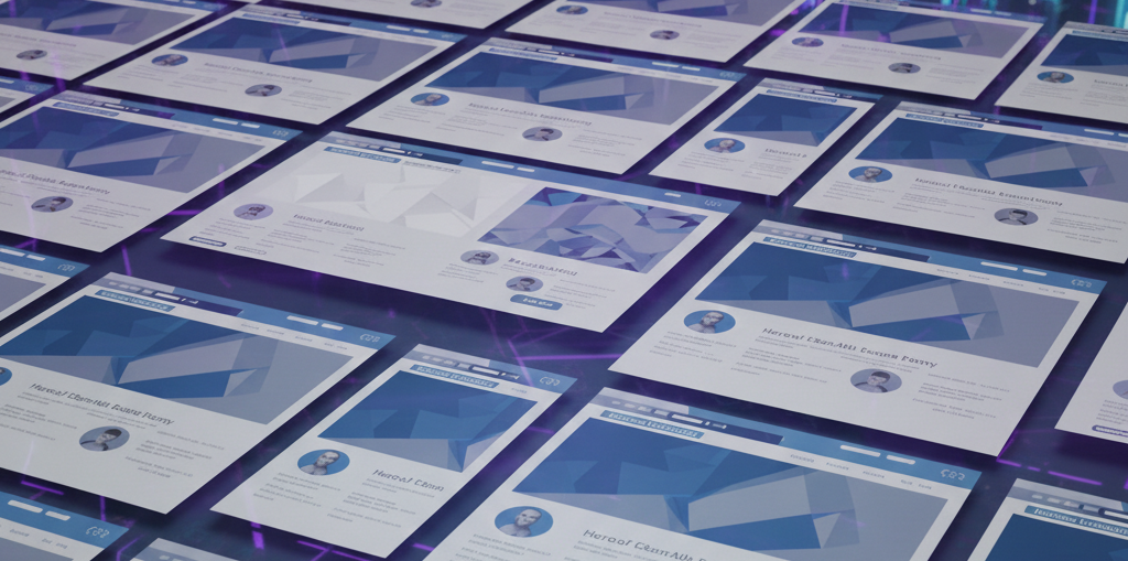
Picking the right header is crucial to website reception. Will the user stay on the website or bounce? That depends on what he will see!
In this post we’ll explore design choices during choosing and building headers sections (also know as hero components).

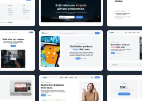
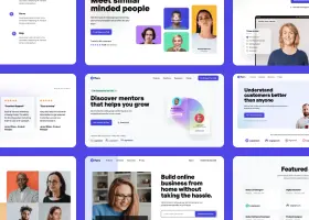
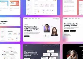
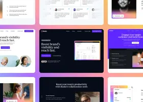
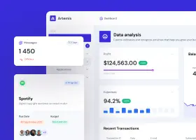
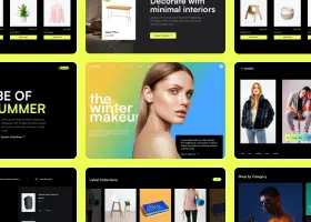
In Shuffle we have over 270 header components in different UI libraries. They represent different aesthetic and usability visions. We’ll go through some examples here, and you can see the entire collection with source code here.
Put your headline in the center of hero components
The first element that speaks to the user is the slogan. Most hero section layouts revolve around it. The headline must be the central element, boldly conveying the main message of the page.

There are many theories about what the text should convey and they differ from industry to industry. Here, for example, you will find detailed guide for writing SaaS headline with examples. One thing is certain – it needs to grab attention, introduce the story and be relatively short.

Key visual is, well, the key
The second important aspect is key visual. These graphics will give style and character to the entire page, complementing the message of the headline. If it is a page about a specific product, choosing it is easy.

However, when it is an agency site or a slightly more abstract business, the aesthetics and the right emotional message of the graphic are more crucial.

Show your users what they have to do
The third important element is to clearly show the user what to do next. What action to take or what to click on. You need to plan the user’s path and give them a chance to complete it with buttons or forms.

If someone already trusts you, brag about it in hero component
The fourth aspect is social proof. If you can show off customer ratings or logos of companies using your product, then visitors are much more likely to stay and explore your website. People like to be fashion trendsetters, but in business decisions, however, most of us would like to choose something that is proven and works.

Copy the code or build whole landing page in visual editor
So much for the hero components.
These were just a few select examples. These were just a few select examples. You can view the full gallery of components together, or by breaking it down into frameworks – Bootstrap, Bulma, Material-UI and Tailwind CSS components and types.
Use our visual editor to combine them with thousands of other components in the same style. Once you’ve built the template and completed the assets, export the code and deploy it freely!
