

Select or upload a new image
You can find previously uploaded files under the Project Files tab.
Select any element on the canvas to activate its settings menu.
Lorem ipsum dolor sit amet, consectetur adipiscing elit. Sed do eiusmod tempor incididunt labore et dolore magna. Aliqua ut enim ad minim veniam.
null is a special value that means "do not set nothing".
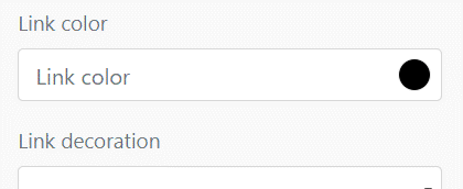
This variable is used to change base text color in dropdown menu. To change link colors, please go to $dropdown-link-color.
 compiler.
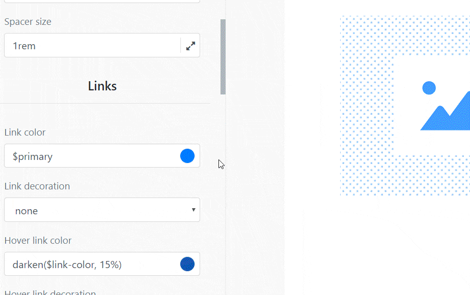
You can use CSS values or Bootstrap variables, just like in .scss files.
We'll show you a Bootstrap variable name and its default value on the label hover. Click on the label to restore input to the default value.
Instead of writing values by hand, you can use pickers specially prepared for colors, sizes, shadows, transitions, and fonts.
Bootstrap Styles menu has two preview modes. One is for your pages (e.g., index.html), and the other is for Bootstrap UI components of the current category.
By default custom components are saved globally (it is the same object).
If you want to create a new object with its own content, please use save as new component.
There is a newer version or session on the server. Please reload the editor to resolve.
Hint: In 9 cases out of 10 it is caused by opening the same project in multiple browser windows.
Try to use Shuffle Editor on higher resolution or change your device.
You can find previously uploaded files under the Project Files tab.


Use the search input
to browse the Unsplash library.
Select or upload a new SVG icon.


No icons found!
You have picked UI library, so now it is time to select the components. Use the left column to select a category of components. Drag them into the canvas to add them to your project.
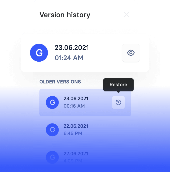
Keep shuffling the versions to choose the best one!
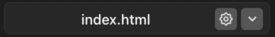
Add all the pages your project needs. Click on index.html to bring up a menu for adding more pages. There you can rename the page you are working on or add a new one.
Click on a component dragged onto the canvas to see the editing options. If you are not sure where to click, select the component from the HTML tree at the bottom. Change the text or image in the right column.
Change CSS classes inside the editor at your convenience. Click on the element you want to change and type in the class name. You can choose between existing classes, or add completely new ones!
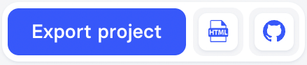
Finished working in the editor? Export the code package to work on it further, or upload it to the server. Click export project and choose the format you like.
We do not hold you back in our editor or restrict you in any way. Don't forget to read the export readme, where you can find out what's in our packages.

Git integration allows you to configure auto deployments with platforms like Vercel, Netlify, Firebase, and many more.
Create Account
SSH integration allows you to configure auto deployments to any hosting provider.
Create Account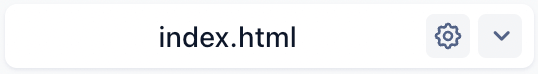

Use the left column to select a category of components. Drag them into the canvas to add them to your project.
After dropping the component on the canvas, you can turn on Drag Mode, move elements around, and add new elements.
Create as many pages as your website needs. Manage them from the dropdown menu.
You can customize the chosen framework here. It doesn't matter if the framework uses Sass, tailwind.config.js, or theme.js. We will show you the same understandable visual interface.
The right menu allows you to modify an element's CSS classes and create new ones when needed.
Shuffle allows you to download the project in HTML, JSX, and PUG formats. Use icons near the Export button to switch formats.
If you don't want to download the project on your disk, export it to the Github repository. This option allows you to configure auto-deployment with platforms like Vercel, Netlify, etc.
Here's a list of keyboard shortcuts that would speed up your workflow.
Save a copy of the current project version in the history. We also save it automatically every few minutes.
Open/Close Components library.
Toggle the drag mode for a component.
Undo the last action.
Redo the last undone action.
Open Change Styles menu.
Open Custom HTML (when hovering on a component).
Move a component UP or DOWN (when hovering on a component).
Change a component to PREVIOUS or NEXT in a library (when hovering on a component).
Delete a component (when hovering on a component).
Change page preview to <number> (when you've created more than one).
Resize the preview window to desktop size.
Resize the preview window to tablet size.
Resize the preview window to mobile size.
Open the preview in a new window.
Export the project.
Close modals.
Try Shuffle supporting tools.
 Open Alternatives

 UI Library Creator


 Try Shuffle Layout


 Talk to AI Assistant


Check Frequently Asked Questions .
Grouping classes allows you to reuse the same sets of classes among different elements on your pages.
No grouped classes have been created.


 Tailwind CSS
 Bootstrap
 Bulma
Bulma
 Material-UI
 If you want to verify the source files first, download the examples.zip file.
 Create an account to unlock all customization features and 10,000+ UI components for Tailwind CSS, Bootstrap, and more.
 This is a demo mode. If you have an account, please sign in.